What makes great brand guidelines?
Successful brand guidelines help internal teams and external partners uphold a consistent brand identity when creating offline and digital experiences. There are several hallmarks of great brand guidelines:
- Online: The days of using static documents to house your brand guidelines are over. Digital brand guidelines are easier to navigate, access, update, and share than PDFs.
- Practical: The best brand guidelines are more than just an instruction manual. They include text and images illustrating how to apply your brand elements. You can also make each component downloadable.
- Comprehensive: The more relevant information and context you include in your guidelines, the greater the chance employees will use your assets as intended. Many teams add “dos and don’ts” for different file types or show use cases.
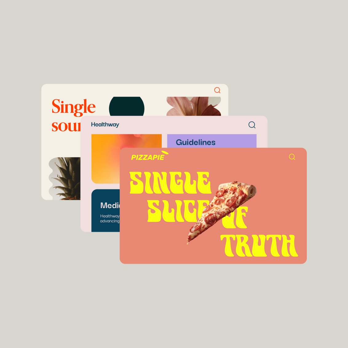
If your organization doesn’t have a detailed set of brand guidelines or your existing ones need an update, here are 19 examples from leading brands to inspire you.
(The guidelines are in no particular order — we don’t want to play favorites.)
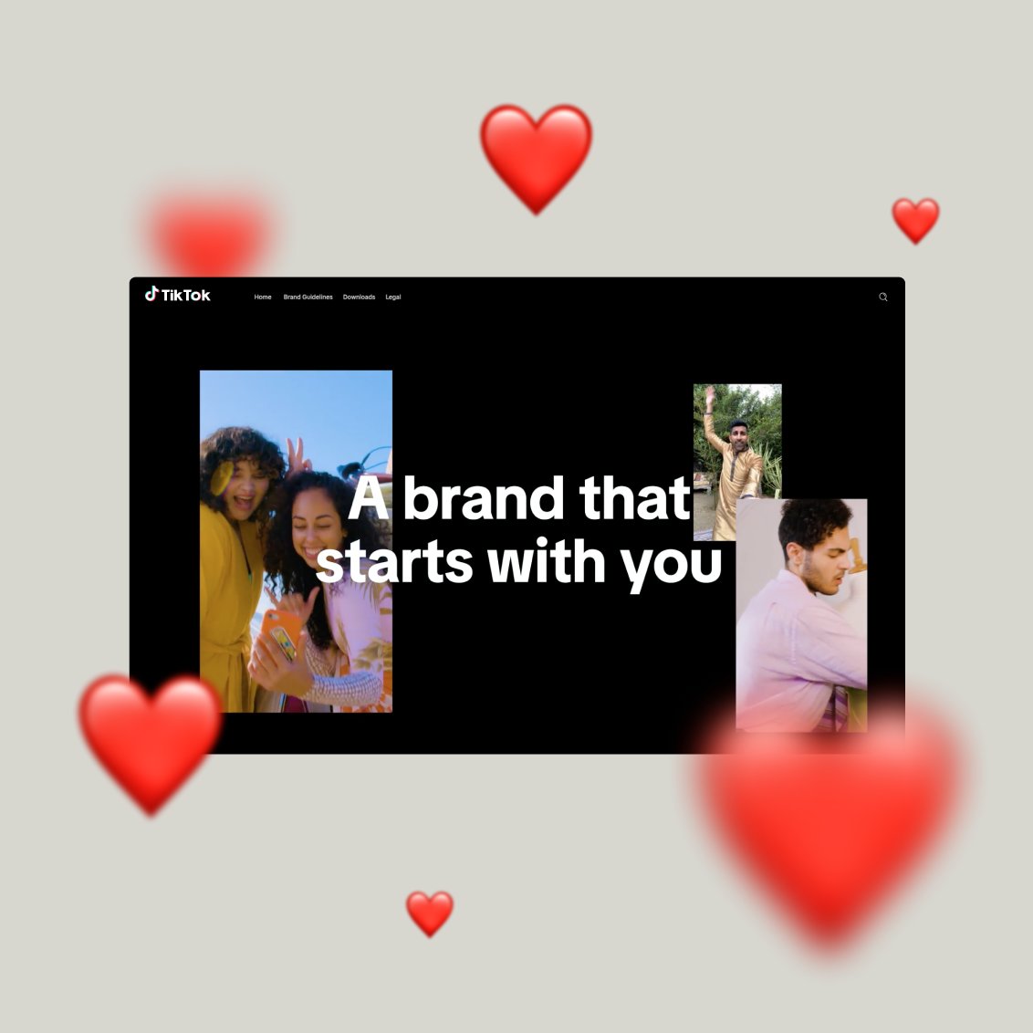
1. TikTok (built on Frontify)

TikTok makes its comprehensive brand guidelines publicly available online. This means anyone can download TikTok’s latest brand assets, like logos or color palettes, which helps ensure consistency for the platform’s global image.
Why we love these guidelines:
- App-specific guidelines: An entire section explains how to create content within the TikTok app.
- Co-branding consideration: Many brands use TikTok as a marketing platform, so including information about co-branding shows a clear understanding of how the brand is used in the real world.
- Downloadable assets: Users can download TikTok’s core brand assets directly from its guidelines rather than going to a separate folder or tool.
2. Deezer

Deezer’s brand guidelines are vibrant, highly visual, and easy to navigate. Users can go directly from Deezer’s brand guidelines to the resource center to download the relevant brand elements.
Why we love these guidelines:
- Motion: Deezer dedicates an entire section of its guidelines to motion behaviors to help users apply movement to text and visual components.
- In-use examples: Deezer inspires its creative teams by showing real-life cases of brand elements in use alongside the instructions.
- Dos and don’ts: For all the core elements of its brand, Deezer provides clear dos and don’ts so that everyone understands the nuances of using each element.
3. IBM

IBM’s brand guidelines share the company’s guiding principles, its ethos, and resources to bring the brand to life.
Why we love these guidelines:
- What’s new: The best brands continuously evolve. IBM has a dedicated “what’s new” section so users can easily see what’s been updated recently.
- Data visualization: IBM’s brand guidelines include a section on data visualization to help teams create charts that communicate messages clearly.
- Resources: IBM links to design tools and repositories for people to apply its brand elements. For example, designers can download libraries and kits for Sketch and Adobe and integrate core components into their everyday tools.
4. Netflix

The Netflix brand site lets anyone access its guidelines for logo usage, but you need to request access to other brand materials — a great example of effective brand governance.
Why we love these brand guidelines:
- Co-branding guidelines: Netflix provides clear guidance on how partners should use its logo for co-branded marketing materials.
- In-use examples: The brand guidelines share several use cases of its branding in different digital and offline applications.
- Things to avoid: Netflix shows how not to apply its logo and brand assets, ensuring people place its core elements consistently.
5. Beyond Gravity (Built on Frontify)

Beyond Gravity understands that every interaction someone has with a brand matters. Besides covering how the brand looks, the guidelines explain how it sounds and (physically) feels.
Why we love these guidelines:
- Invokes more of the senses: The guidelines include the brand's soundtrack, an audio version of its logo, and suggested materials for creating physical copies of branded documents.
- Image editing recommendations: The brand guidelines provide recommendations on editing images and photos to match Beyond Gravity’s brand style — a subtle way to create a consistent visual brand identity.
- Instructions for talking about the company: Tone of voice guidelines include a list of dos and don'ts for talking about the company, its employees, and partners.
6. Hulu

Hulu’s digital brand guidelines are concise but practical. Users can download a more detailed guide to learn more about the brand, but all the core elements are easy to find and use.
Why we love these guidelines:
- Downloadable assets: Users can download Hulu’s main brand files — such as logos and icons — directly from its brand guidelines.
- Audio and visual (AV) brand elements: Video and audio are how many people encounter Hulu’s brand. Including AV branding in the guidelines recognizes its importance to the brand.
- Print-specific guidelines: Hulu shares print-specific guidelines for people to choose the correct color palette and ensure consistency for printed and digital media.
7. Herman Miller

Herman Miller has detailed brand and identity guidelines to ensure a consistent brand presentation across all touchpoints, both physical (e.g., brick-and-mortar stores) and digital (e.g., campaign ads).
Why we love these brand guidelines:
- Vision and mission: Herman Miller helps everyone understand the importance of its brand by sharing the company’s vision, mission, and values to introduce its brand guidelines.
- Brand history: Herman Miller can look back on over 100 years of brand history, and it shares its brand evolution and development to make people feel part of this story.
- Downloadable templates: The guidelines include downloadable templates for frequently used marketing materials — such as emails, website pages, and presentations — to maintain brand consistency and improve creative efficiency.
8. Trustpilot (Built on Frontify)

Trustpilot’s brand hub shares detailed brand guidelines that cover everything from visuals to written brand elements. You can download core assets and find instructions on using each component.
Why we love these guidelines:
- Localization: Trustpilot’s tone-of-voice guidelines include localization style guidelines to adapt brand materials to different languages and local markets.
- Downloadable assets: The guidelines include an extensive library of files — users can download everything from sub-brand logos to icons and video clips.
- Co-branding guidelines: Many companies are proud of their Trustpilot reviews and want to show off their ratings. To facilitate this, Trustpilot provides detailed guidelines for co-branded marketing materials.
9. Mastercard

The Mastercard brand center offers guidelines, downloadable assets, and other relevant information to ensure a consistent brand identity.
Why we love these guidelines:
- Latest updates: Mastercard puts a brief summary of recent updates at the top of its brand guidelines so everyone immediately sees what’s changed and when.
- Downloadable assets: Users can download brand artwork in different formats and for various use cases directly from the brand guidelines.
- FAQs: Mastercard dedicates a page to frequently asked questions to help users navigate the guidelines and find the relevant files — without additional support from their brand team.
-
10. Instagram

Instagram’s brand portal is a highly visual overview of its most recognizable brand elements: its font, gradient, and layouts. It goes deep into these three areas to ensure branded materials are instantly identifiable.
Why we love these guidelines:
- Typeface previews: The brand guidelines contain editable sections where people can add custom text and preview it in the different Instagram fonts and color palettes.
- Colors and gradients: The guidelines share color codes, visual examples of core colors, and details on using them together to create Instagram’s recognizable gradients.
- Permission guidelines: Many creators or brands like to showcase their Instagram account or community. Instagram provides guidelines on requesting permission to ensure a consistent presentation of its brand.
11. Tonies (Built on Frontify)

Tonies has built Tonie-World, a central hub that documents its brand style guide, vision, mission, UI elements, media library, and more.
Why we love these guidelines:
- Accessibility: Tonies wants all users to be able to interact with its products, including those with different access needs. So, the very first section of its style guide is focused on creating accessible brand content that meets WCAG (Web Content Accessibility Guidelines) standards.
- UI kit: Tonies’ UI kit provides guidelines on creating elements and components for its interface to ensure a consistent experience when interacting with web pages and applications.
- Dos and don’ts: The guidelines contain many practical examples showing how (not) to use the brand elements.
12. Starbucks

The Starbucks brand guidelines help users understand the main elements that make up this global brand. Real-life case studies show how the brand should look and provide creative inspiration.
Why we love these brand guidelines:
- Philosophy first: The first thing users see in Starbucks’ brand guidelines is its philosophy, connecting you with its brand vision and mission.
- In-use examples: Starbucks inspires with real-life cases of campaign materials across various mediums and use cases.
- Customizable brand elements: Users can customize elements within the limits of its brand — for example, trying different color logos, font weights, or backgrounds, allowing for creativity without compromising on brand recognition.
13. DevRev

The DevRev visual identity guidelines introduce users to the core elements of its brand identity, from logos and color palettes to voice and tone.
Why we love these brand guidelines:
- Quick download option: Users can click a single button to download all of DevRev’s brand assets in one go. Perfect for busy creatives.
- In-use examples: The guidelines contain a gallery of brand materials to see how the elements work together to create a cohesive visual identity.
- Simple navigation: The collapsible navigation lets you jump between the sections of the guidelines quickly so you can easily find the elements and resources you need.
14. Sinch (Built on Frontify)

Sinch’s brand guidelines contain detailed guidance on how to present the brand consistently. Besides sections on the brand’s visual assets, it has an in-depth tone-of-voice section to help people understand how the brand should sound.
Why we love these brand guidelines:
- Collaborative guidelines: Sinch gives users a specific point of contact to go to with questions about its brand identity and allows them to request a specific brand asset for their work.
- Brand architecture: Sinch’s product offering comprises multiple sub-brands that sit under its brand “umbrella.” Users can access files for each sub-brand, in line with the global brand strategy.
- Tone of voice: Sinch provides detailed tone-of-voice guidelines. For example, it offers variations of the same technical error message. Each one contains explanatory notes about which parts of the message are good or why the copy doesn’t quite align with the brand’s voice.
15. Dropbox

Dropbox’s brand guidelines break down its brand into four core areas: strategy, foundational elements, design system, and writing.
Why we love these brand guidelines:
- Customer focus: The guidelines explain how to subtly adapt brand visuals depending on where customers are in their journey with Dropbox. This puts customer needs front and center for the Dropbox creative team.
- Design system: Dropbox links to design system guidelines to help UI/UX teams deliver cohesive, high-quality experiences across the product suite.
- Writing guidelines: Dropbox knows that a recognizable brand voice is just as critical as a brand’s visual identity. It links to voice-and-tone guidelines as part of its brand guidelines.
16. Instacart

Instacart’s online brand guidelines share the information and brand files its creative teams and partners use most often.
Why we love these brand guidelines:
- Visual navigation: From the home page, users can jump to different sections of the guidelines, such as illustrations, icons, or colors. You navigate via a visual menu of cards that look like the relevant section.
- Downloadable elements: Users can download Instacart’s main brand elements — such as logos or icons — directly from the brand guidelines.
- Guidelines for sub-brands: Instacart has several additional brands that extend its main brand but have their own distinct identity. These sub-brands have their own section within the guidelines.
17. Airbus

The Airbus Brand Center provides comprehensive tools, guidelines, and best practice examples to help its teams present a unified brand identity. It includes written guidelines, editable templates, and a library of approved assets that are ready to use.
Why we love these brand guidelines:
- Use case guidelines: Airbus provides custom guidelines with visual examples for some of its most common use cases — from aircraft liveries to poster design.
- Downloadable templates: Users can download editable templates of frequently used brand assets, including slide decks and email templates.
- UI/UX guidelines: The digital experience is a crucial part of your brand, so Airbus provides detailed UI and UX guidelines for its designers and developers.
18. Firefox

The Firefox brand guidelines provide an introduction to the brand’s purpose and personality but also include details, such as specific guidelines for logos, colors, and other core brand elements.
Why we love these brand guidelines:
- Quick links to most used assets: The top navigation menu provides a quick link to download files like logos and icons.
- Practical color guidelines: Users can click on any color in the Firefox color palette to copy the HEX code.
- Dos and don’ts: The brand guidelines illustrate how the brand should look, alongside examples of off-brand usage of its main elements.
19. Klarna

Klarna’s brand guidelines give an engaging introduction to the brand and its elements. Concise written instructions and downloadable assets and resources help teams present a consistent identity for the brand.
Why we love these brand guidelines:
- Highly visual cover page: A scrollable cover page displays the brand mission and examples of past campaigns as your first interaction with these guidelines.
- Tone-of-voice guidelines: Concise voice-and-tone guidelines share examples of rewritten content and specific brand language preferences.
- Simple navigation: From the navigation menu, users can quickly jump to core brand elements such as colors and typography.
Inspired to build your own brand guidelines?
Some of the world’s leading companies use Frontify’s all-in-one brand-building platform to house everything related to their brand. Here’s what you can do with Frontify:
- Customize your brand guidelines to cover all the elements of your brand — from color palettes to motion to audio.
- Share guidelines with your internal team and external partners, including setting access restrictions where necessary.
- Easily update your guidelines without needing to work with a design agency.
Ready to ditch your PDF brand guidelines and bring them online? Request a demo to learn more about the Frontify platform, or start a free trial and see how easy it is to document your brand today.