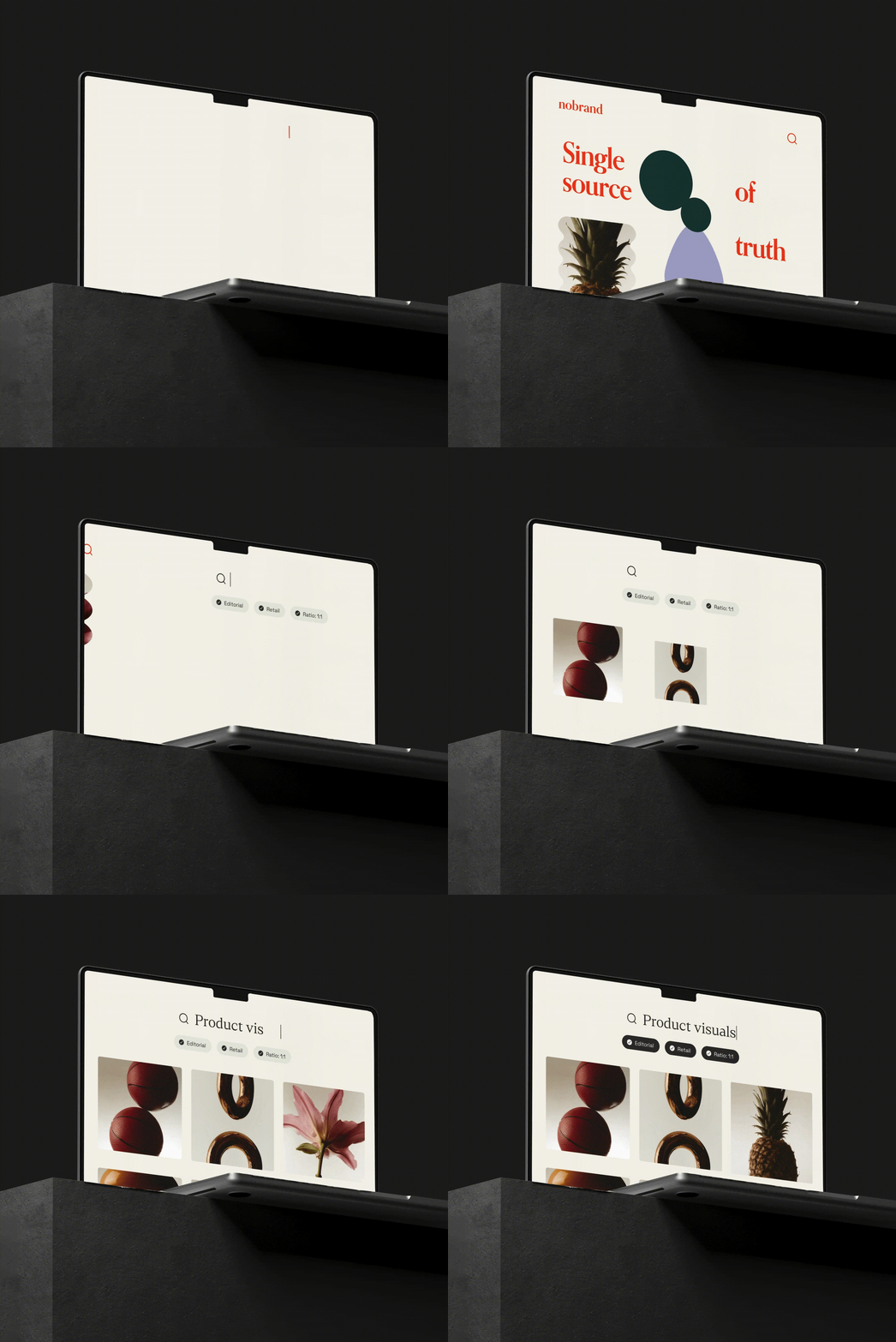
Picture this: A prospective customer opens your sales deck, and the logo is stretched, the colors are off, and the visuals don’t match what they've seen on your website. It looks like it came from a different company altogether. Moments like these chip away at brand credibility, but they’re all too common without a clear brand style guide in place.
A style guide is a centralized reference that defines how your brand should look, sound, and feel across every channel — from logos and colors to tone of voice and typography. A strong style guide acts as creative infrastructure and sets the foundation for consistent, confident execution across all channels.
In this guide, we’ll cover what to include in a style guide, how to build one, common mistakes to avoid, and real-world examples to inspire your own.

What is a style guide, and why does it matter?
A style guide is a centralized, easy-to-use resource that defines a brand’s visual and written identity. It ensures consistency by clearly explaining how your brand should look, sound, and feel across every touchpoint. It also provides clear, actionable standards for using brand elements like logos, colors, fonts, imagery, and tone of voice.
Style guides can range from simple visual references to robust, interactive systems. They typically cover core identity elements (like those listed above) but may also include messaging frameworks, motion design, accessibility standards, and usage dos and don’ts.
Why style guides solve real problems
Without a central style guide, teams work in silos. Designers riff off old files, marketing crafts new messaging without context, and product writers scramble for tone direction. The result? Inconsistent visuals, confusing communication, and wasted time.
A style guide fixes this by:
- Helping new team members and partners ramp up fast. With clear, actionable guidelines at their fingertips, they don’t have to hunt or guess; they can just start doing.
- Aligning all teams — from design and content to product, marketing, and sales — with one source of truth. Everyone sees the same expectations for logos, colors, voice, templates, and messaging, so every output feels like your brand.
- Reducing back-and-forth by answering common questions up front.
Did you know? You can build your style guide directly in Frontify and give every team live access to the latest brand rules, with no digging and no bottlenecks.
Style guide vs. brand guidelines
The terms brand guidelines and style guide are often used interchangeably, but they’re actually two different parts of the marketing toolkit.
Brand guidelines document everything from a brand’s personality and tone of voice to principles and messaging, including mission statements, brand values, and value propositions. These guidelines communicate who the brand is and serve as a comprehensive hub for internal stakeholders to understand brand identity at the deepest level.
A style guide tells stakeholders how to effectively apply the greater brand guidelines in their everyday work. It’s a playbook for creatives, from hired developers to marketing agencies and influencer partners. A style guide contains the rules they need to make stylistic choices, like what color palette to use in a new web layout, which font to use on a billboard, or where to place the logo in an Instagram post.
In small organizations, design agencies, and individual creative teams, the style guide often doubles as the brand guidelines. But for larger organizations and more complex brands, the style guide lives within the brand guidelines — it acts as a playbook that offers prescriptive advice for how teams can execute the vision outlined by the brand’s overarching guidelines.
What should a style guide contain?
To create a comprehensive style guide, you’ll want to document every element of your brand. That includes everything from basic assets like logos to guiding resources like mood boards. And the more you include in your style guide, the easier it will be for creatives to incorporate its guiding principles into their work.
Make sure your style guide provides a quick explanation of the company's mission and vision statement and a list of brand values. These will help creatives paint a clear picture of who the brand is and how it communicates its identity.
Including various branded assets also helps strengthen brand engagement:
- Downloadable logos with different formats for social media, web, and other uses
- Editable templates, including advertisements and email newsletters
- Approved visuals, such as product photos and stock imagery
- Color palettes with swatches and different color codes (CMYK, HEX, and RGB)
- Fonts with specifications for web and print use, as well as heading sizes.
Guidelines for the brand’s tone and voice, which describe how the brand communicates with different stakeholders and across various platforms.
The contents of your style guide will evolve over time as you refine your brand. If you’re strategic about how you create and use your guide, you’ll always have a valuable resource for all of your stakeholders.

How style guides help fix common brand issues
Eliminates confusion with centralized governance
Style guides stored in a single, centralized location remove ambiguity around brand standards. It gives everyone fast, reliable answers and ensures that all teams are working from the same source of truth. For example, instead of guessing which version of the logo to use on a slide deck, a marketer can quickly check the guide and move forward with confidence.
Prevents duplication by enforcing unified standards
A style guide helps teams avoid redoing work by clearly outlining what’s already been approved.
With brand elements, voice guidelines, and usage rules all in one place, teams can move forward without second-guessing or starting from scratch. For example, instead of rewriting boilerplate product descriptions or redesigning iconography, marketers and designers can reference the guide and reuse what’s already working.
Builds trust and recognition through consistency
Style guides help teams deliver a consistent brand experience, which builds audience trust and reinforces recognition over time. When your brand shows up the same way across every touchpoint (visually and verbally), it becomes more memorable, credible, and effective.
And it’s not just about looking and sounding polished. A recent Marq report found that stronger brand consistency can boost profits by over 20%. In other words, it’s also a smart business move.
The most common style guide mistakes
There are a few common mistakes that brands make when it comes to style guides. If you're leading a brand, chances are you've run into one (or all) of these issues.
Here’s where things can break down, and how to avoid the issues:
- Outdated, static systems: Downloadable PDFs and slides are hard to maintain and easy to ignore. Instead, implement a living, web-based guide to ensure your team always has access to the latest, approved standards.
- Siloed brand execution: When different teams and different regions can’t easily access or apply your guidelines, brand experience suffers. Make sure your global teams and those working on cross-team, multi-channel campaigns have access to centralized guidance.
- Not built for scale: As your brand evolves, your style guide should too. Keep the latest version of your style guide accessible to all teams. (Did you know? Frontify’s enterprise features help you scale brand consistency without sacrificing speed or quality.)
How to create an effective style guide (5 steps)
Creating a style guide should be a priority. Following the steps we’ve outlined below will help you take a practical, collaborative approach. That way, you can ensure the final product contains all of the resources and documentation necessary to build a consistent brand across all stakeholders.
1. Audit your current brand assets and guidelines
Work with other stakeholders to evaluate your existing materials and identify inconsistencies or gaps in your current assets, standards, and/or guidelines. Include marketing members, creatives, a sales manager, and any relevant company executives. You can also run your final product by a lawyer or legal representative to answer questions about copyrights and trademarks.
Before moving on to the next step, address the inconsistencies and fill in the gaps, so you’re moving forward with a more complete and cohesive style guide. For example, if different teams have been using slightly different logo variations, choose the correct one, retire the rest, and document the proper version(s) in your guide.
2. Define your style guide’s purpose and audience
Next, get clear on why you’re creating a style guide and who it’s for. Are you trying to improve collaboration between creative and marketing teams? Maintain consistency across a growing network of regional offices? Give more teams the tools to work faster and more independently?
Let’s say your product team is consistently misusing brand visuals in pitch decks. In this case, if you decide the goal of your style guide is to empower non-designers to use brand assets correctly, focus on adding clarity to your guide. Include dos and don’ts, downloadable templates, and visual examples tailored to everyday use.
3. Digitize and centralize everything
A digital, centralized style guide enables you to set rules and conditions for using brand assets, create a review process, and control who has access to which parts of the guide. You can also update your digital style in real time, as often as you need to, so everyone is using the current playbook.
With a digital asset management (DAM) system, you can easily upload your style guide and all brand assets for quick accessibility. A modern DAM, like Frontify, supports easy onboarding for all teams so they can seamlessly find and adhere to your unique guidelines.
4. Train your teams and encourage adoption
Rolling out your style guide is about more than just sharing a link with your teams; it's about helping people see the value in using it. Promote the benefits clearly: less guesswork, faster approvals, fewer brand mistakes. Identify key teams who use brand elements regularly, and show them how the guide makes their jobs easier.
It’s also helpful to offer specialized training to different departments, so they understand precisely how to use the style guide in their day-to-day work.
- For web developers and designers: Go over the standards for how to use logos, colors, and fonts, including details like what colors to avoid using as a background for the company logo.
- For marketers, agencies, and freelancers: Explain how to communicate in the brand’s voice, including everything from guidance on word choice and tonality to rules for punctuation.
- For customer support and sales teams: Train them on how to talk about products and specific features when talking to customers, like avoiding terms that have been trademarked by competitors.
5. Monitor and refine over time
Whether you’re expanding into a new market or adapting to changing customer needs, your brand has to evolve if it wants to stay competitive. And the more adaptable you are, the more likely you are to succeed. But changing aspects of your brand requires a team effort, which means you’ll need to regularly revisit and update your style guide to keep everyone on the same page.
It’s helpful to use analytics to monitor how your teams use your style guide. Track usage metrics like unique visitors, page views, and downloads. By tracking these metrics, you get a clear, detailed picture of how your guidelines are being used, helping you make more informed decisions when you need to refine them.
Looking ahead: As AI becomes a bigger part of brand operations, living style guides will turn into brand-trained AI inputs, generating content at scale that still reflects your brand’s voice, tone, and visuals. Frontify’s Brand Assistant is already helping teams turn guidelines into intelligent copilots.

Style guide examples
Use these examples as inspiration for your own style guide.
Nestlé (Built with Frontify)
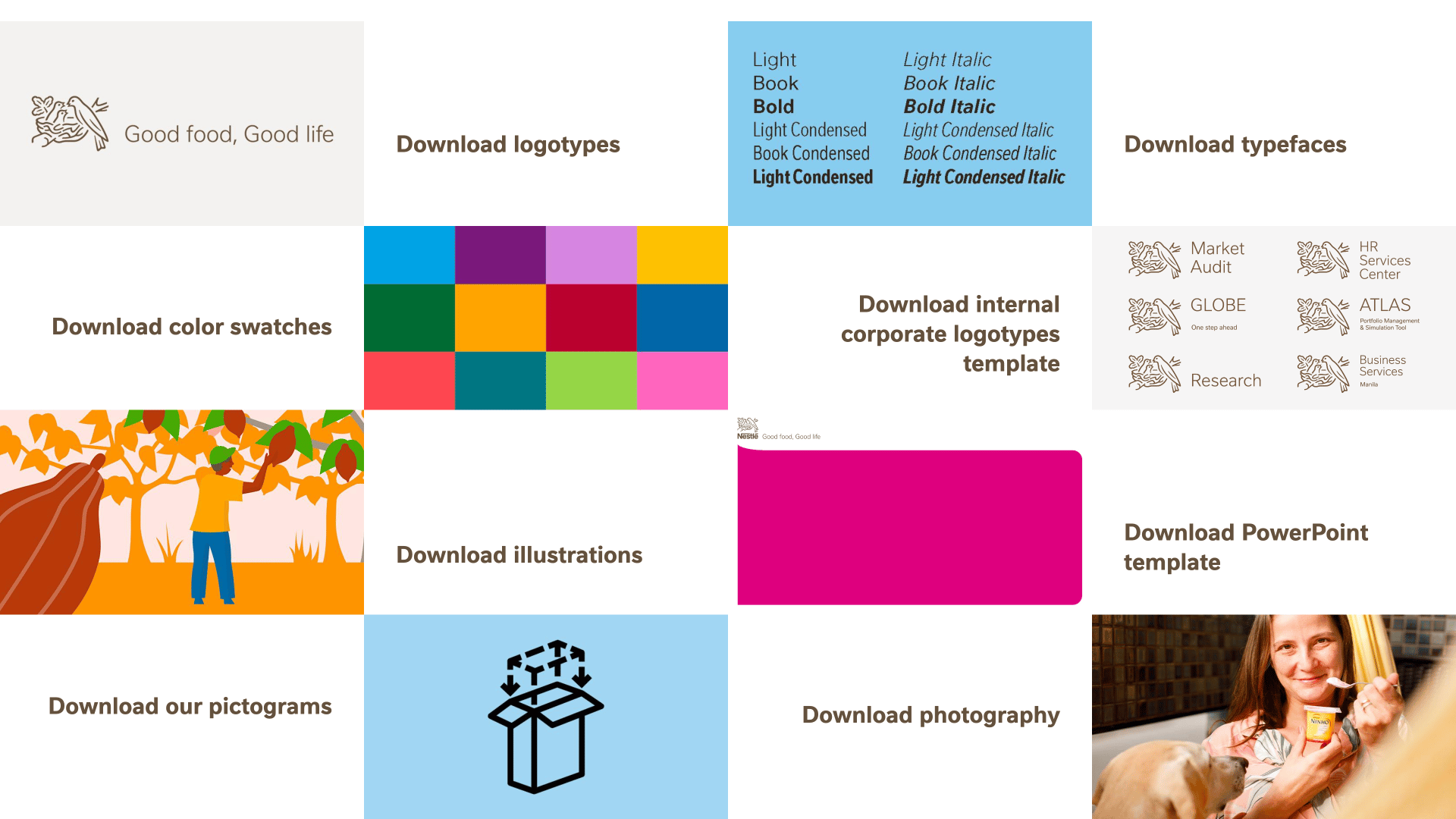
Nestlé’s style guide is instantly accessible and actionable. Right from the start, users can download an array of brand assets, including logos, PowerPoint templates, typefaces, and color swatches. No digging around required.
Mailchimp
Mailchimp’s content style guide shines in editorial tone. It has distinctive guidance for tone of voice and gives actionable voice-and-tone rules, with a TL;DR section that includes examples for seamless application.

Sinch (Built with Frontify)
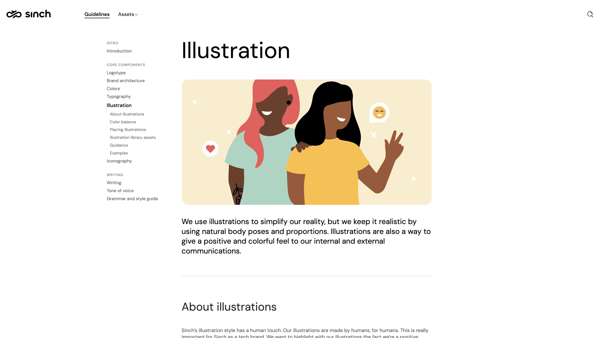
Sinch’s style guide is vibrant and visual. Users get instant access to brand elements through image-led examples and structured sections, making it easy to grasp and apply the look and feel without friction.
NIO (Built with Frontify)
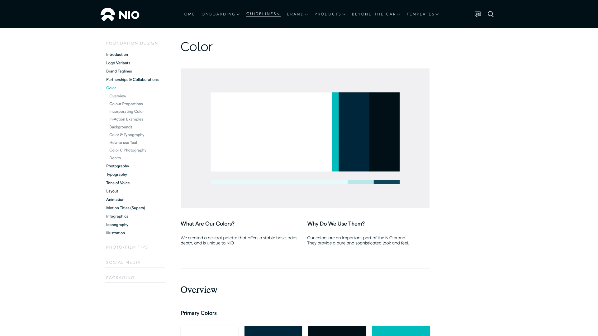
NIO’s style guide is clear and structured. Brand elements like color usage, proportions, and backgrounds are easy to find and apply, with helpful context baked into each section.
Key features of Frontify’s brand style guidelines
Frontify’s cloud-based brand guides and portals make it easy to create, update, and share standards that keep everyone aligned, no matter the team, location, or channel.
Centralized brand governance
When different versions of style guides and brand assets live in scattered folders or on someone’s desktop, employees and partners end up wasting time chasing down the right files — or worse, using the wrong ones. Frontify solves this with a single source of truth: a centralized, cloud-based hub where teams can instantly access the latest guidelines along with logos, templates, and other materials.
Built-in permissions and access controls help you maintain brand governance across departments and regions. You decide who sees what, so everyone follows the correct version of your brand guidelines, and nothing goes out the door off-brand.
Real-time collaboration tools
Frontify brings your teams and their feedback together in one place. Marketers, designers, and stakeholders can seamlessly co-create and iterate on brand assets in real time, with clear visibility into every step of the process.
Built-in workflows and approval tools keep projects moving forward: teams can assign reviewers and set deadlines and approval rules. Everything’s designed to speed up feedback loops and avoid bottlenecks. No more guessing who signed off or when.
Built for scale
Frontify makes it easy to manage brand guidelines at scale. Whether you’re supporting multiple brands, regions, or teams, you can create modular, customizable style guides that adapt to your organization’s unique needs and growth.
From localized content to team-specific permissions, every guideline stays consistent and up to date, no matter how many stakeholders are involved.
Visual and intuitive user interface
Frontify’s clean, user-friendly interface makes it easy for anyone to find and follow your brand guidelines. Clear navigation, visual examples, and drag-and-drop editing help teams adopt the platform quickly and stick to your brand standards with confidence.
Create a comprehensive style guide with Frontify
Some of the most well-known brands in the world rely on Frontify to store and maintain their style guides and brand portals. Housing a style guide as a digital asset makes it easy to customize, maintain, and share with creative partners.
Plus, Frontify is a comprehensive brand guideline platform, which means it can house all of your assets — from logos in different formats to editable templates for employees, not just a style guide.
