What do Nike, Apple, and McDonald’s have in common? Think about it — the swoosh, the bitten apple, and the golden arches are all iconic logos.
And just like any other great brand, these logos are successful for one primary reason: consistency.
Sure, the actual logo designs are easy to read, recognize, and understand. But more importantly, “For a logo to become iconic,” explained Greg Findley, Designer at Mantra, “it needs to be consistent.” From the design to the colors and sizing, successful logos look and feel the same everywhere they appear. And this doesn’t happen by accident: It’s where logo guidelines come in.
What are logo guidelines?
Comprehensive logo guidelines help create a consistent, cohesive brand image: They train your teams on how to use your logo, which “mitigates so many common mistakes in its use,” explained Arham Khan, co-founder of Pixated. Generally, these guidelines are a single, easy-to-access resource that houses everything from downloadable logo assets to clear instructions for using them.
Let’s look at some essential things you should cover in your logo guidelines.

Logo description
This short statement describes the visual appearance of the logo and explains the philosophy behind the design. It helps stakeholders understand what your logo stands for and how it relates to your greater brand identity.
Remember that your logo is more than just a branded asset on your website and business cards: It’s a visual representation of your brand that includes everything from its values and mission to its personality. Explaining how it communicates your message and supports its identity provides context that makes stakeholders better brand representatives.
Logo types and variations
The experts we surveyed suggested creating at least four downloadable logo variations to ensure you have an appropriate trademark for every use case:
- Primary logo: According to Oskar Duberg, Senior Brand Marketing Specialist at Frontify, a primary logo “represents your brand’s core identity” and serves as the foundation for all other logo versions.
- Secondary logo: David Victor, CEO of Boomcycle, suggested that a secondary logo should be a simplified version “designed for smaller spaces or digital use.”
- Color variations: Geoff Cudd, founder of Don’t Do It Yourself, recommended including color variations, such as an inversely colored option and a monochrome option.
- Orientation variations: Anticipate different designs and include logos for horizontal and vertical layouts.
These variations will help you have a version of your logo ready for most contexts and environments. They should all look and feel very similar: You’re not creating a new logo each time — you’re just making sure it works in many different situations.
Logo size
Define sizing parameters to help ensure the logo always looks clear, and its size and scale are proportionate to its context. For example, you could include minimum dimensions for your logo to ensure it remains legible on screen and in print.
Consider offering guidelines on maximum sizing for everyday use cases to help avoid feedback rounds where folks ask designers to “just make the logo a bit bigger.”

Spacing
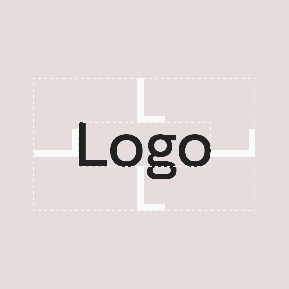
Include guidance on logo spacing: These instructions specify how much space to leave around your logo — from the edge of documents or from different elements in your design, like text or other images.
The space around your logo is important because “too much white space will make the logo look small and insignificant, while too little space will mess up the balance of design elements in a page or poster,” explained Cudd

Colors
Set out the color specifications for your logo: Define the colors for different models and formats, including Pantone, CMYK, HEX, and RGB values. This will ensure consistent color usage across print and digital to provide a visually recognizable logo that doesn’t subtly shift across platforms.
Typography
Include a typography section if your logo includes a typemark and a symbol. These should cover what font and weighting to use in the text part of your logo. You should also specify if and how your logo typemark should be capitalized: For example, the letters H and S are capitalized in HubSpot’s logo, while Help Scout’s typemark puts a space between the two words in its brand name.
Placement and use
Cover where to place your logo in different scenarios: Define where it should go on a document or in an email signature, for instance. These specifications will help you maintain a consistent visual style and ensure your logo is visually prominent but does not overshadow the rest of your content.
Do’s and Don’ts
Make potentially abstract guidelines more practical for your users by creating a bulleted list of do’s and don’ts for your logo. This will help your team understand what successful (and unsuccessful) logo use looks like.
“Utilize visuals,” recommended Kate Wojewoda-Celinska, content manager at Spacelift. She continued to explain that visuals will “give a concrete example of how things should look when put into practice,” which will be much easier to understand and adhere to than a list of written instructions.

Co-branding
Set out rules and instructions for pairing your logo with another brand. This will be helpful if you enter into partnerships or work on co-branded content projects. Cover how the two logos should be placed relative to each other, such as above each other or side by side.
Make sure you give guidance on how much space to leave between logos so they don’t crowd each other. “The logos should complement each other while retaining their individual brand identities,” explained Duberg.
External use
Illustrate how to use your logo outside your business: Other people, such as partners or journalists, may need to use your logos, so make sure you have versions and instructions ready, so you can present a consistent visual identity across publications — even when you have less control over the presentation of your brand.
Why are logo guidelines important?
Guidelines help internal and external stakeholders consistently use your logo, supporting a cohesive brand identity. Your logo is the visual that people will most closely connect with your brand, so presenting uniformity across channels and settings helps build brand recognition and strengthen that association.
Protecting your brand identity
Logo guidelines help protect against damage to your brand’s reputation. Duberg explained that using logos in an “inappropriate context” or changing how they look “can dilute the brand’s identity and confuse customers.” With detailed guidelines, you can help prevent that dilution and reduce the risks that people will get creative with your logo.
You’ll reap many long-term benefits when customers recognize and trust your brand. For example, if you launch new products or services, “your audience will embrace it with the same belief, all thanks to the trust and loyalty your logo inspires,” said Ariav Cohen, VP Marketing and Sales at Proprep.
Maintaining consistency in large organizations
You might think the people most likely to misuse your logo will be external stakeholders or partners. But you’re just as likely to find people within your organization who use old logo versions or the wrong color palette or positioning.
Many people in your company contribute to your brand identity and use your logos daily or weekly — including marketers, sales, and HR. Logo guidelines keep them on the same page, so you can be confident your core brand asset is being used consistently across the business.
3 Best logo guidelines examples
If you plan to document your brand’s logo guidelines, getting inspired by other companies’ guidelines helps you understand what to include:
TikTok
Video-sharing social media platform TikTok makes its brand guidelines publicly available online. The logo section shares its primary, secondary, and tertiary logos and explains when to use each one.
The guidelines also cover logo placement and sizing to ensure users create a consistent brand image. A section on co-branding helps understand how to use TikTok’s logo alongside their own.

Alpine
Automotive company Alpine shares visual examples to demonstrate the proper use of its logo in everyday scenarios, including business cards, lanyards, and headed paper.
Alpine also lets users download its logotype directly from its logo guidelines, making it quick and easy for people to get the version and file format they need.

Beyond Gravity
Rocket-launch specialist Beyond Gravity provides detailed guidelines for using its logo, including explaining when to use different color versions depending on the background. Its guidelines also specify spacing and sizing for its standard logo and special or adapted formats. Precise logo sizes for standard printed paper sizes are a quick, helpful point of reference for people using it.

Ensure consistent branding beyond logo use with comprehensive brand guidelines
Your logo is just the starting point to create a consistent, recognizable brand identity. Looking at the companies we shared above, you’ll notice that the logo guidelines are just one part of more detailed brand guidelines — covering everything from color palettes to icon usage and audio.
“Consider creating a comprehensive brand identity guide,” suggested Duberg. “It should cover not only your logo but also other brand elements, such as imagery, tone of voice, and brand values.” Once you’ve documented your guidelines, you’ll also want to consider how people will find and use them.
Consider cloud-based guidelines — like TikTok, Alpine, and Beyond Gravity. Online guidelines are easily accessible for designers, marketers, and other key stakeholders, and you can even allow people to download assets right from the guidelines.


