Product Roundup April 2019 – Part 1
A lot has been going on at the product front since the beginning of 2019. This first part of our product roundup two-piece presents our latest product improvements.
Improved Filter Search
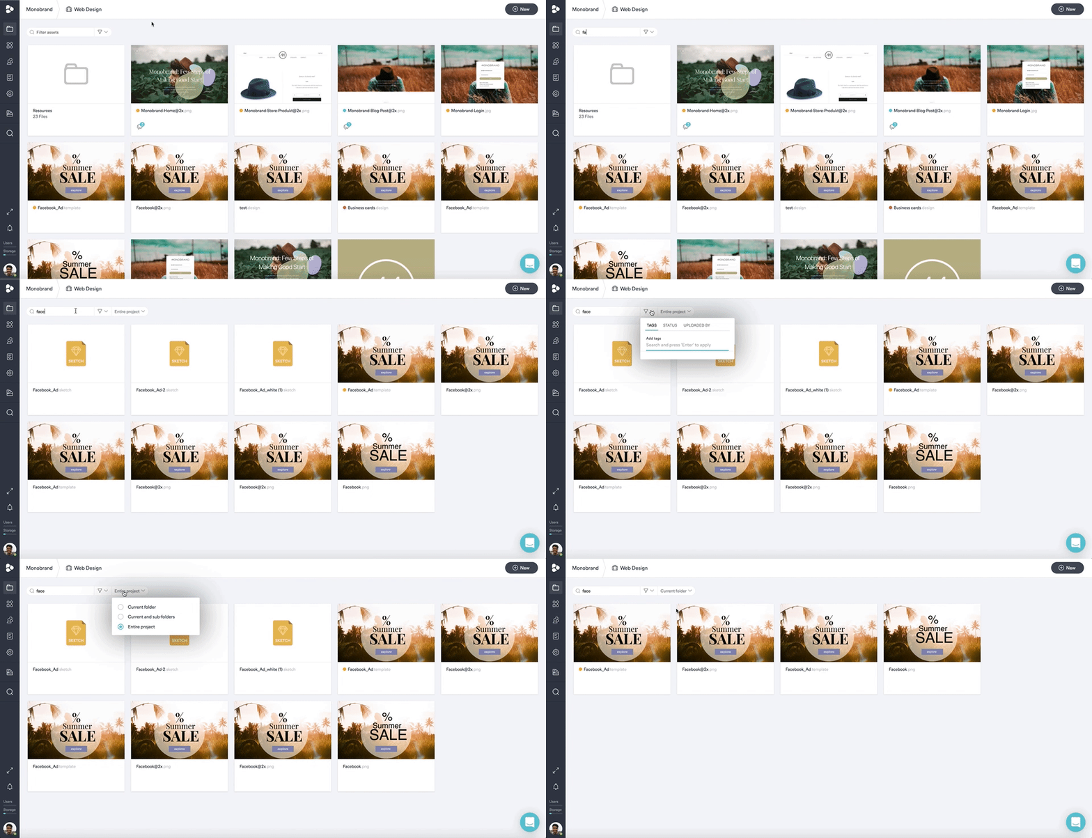
The improved filter search allows you to search assets across every project, and library. Search tags, uploader, or even workflow status, to find the required assets within seconds. As soon as you search for a key term, a new drop-down will appear, allowing you to choose whether you want to look for an asset in the current folder, in the current folder plus its subfolders, or even across the entire project.
Bulk Action Additions
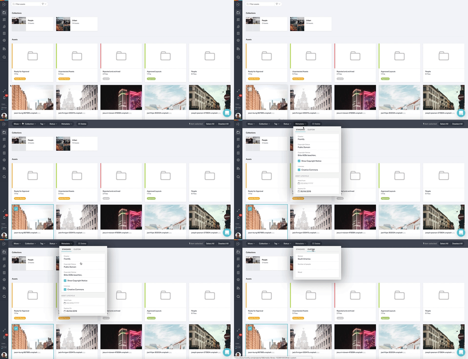
We updated the bulk actions, which appear on the top of your screen once you’ve selected an asset. The new buttons are now more visually appealing, and it’s consistently aligned throughout the application. Function-wise, you’re still able to move assets to folders or collections, and assign tags or statuses. Now, you also have the option to modify metadata, change standard settings like the creator’s name, licenses, and to set up asset life cycles or copyright notices through bulk action as well. Read more about it here.
Filter Pills View in Media Library
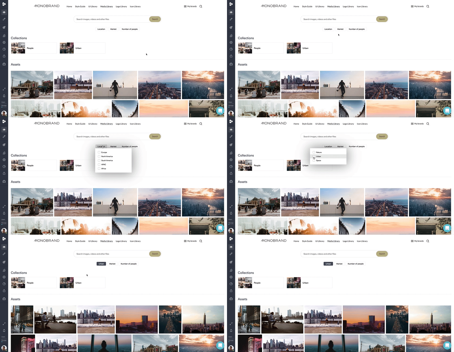
Just like before, you’re able to filter your assets by metadata, simply by clicking the dropdown next to the search bar of your Media Library consumer view. If having all your filters clustered in facets seems a bit overwhelming, you now have the option to display your filters in a pill-view. Watch this video to learn how to set it up.
Terms & Conditions Settings
The process of accepting the terms and conditions got more straightforward. From now on, terms and conditions settings will appear immediately as a public sharing-link is generated. You can decide whether or not you want to allow user interaction on the public link before accepting your terms and conditions. Do this by toggling the new ‘prevent user interaction’ button. Once activated, users following the public link have to accept the terms and conditions at the bottom of the page before being able to interact with the page. Read more about it here.
Usage Page Dashboard Update
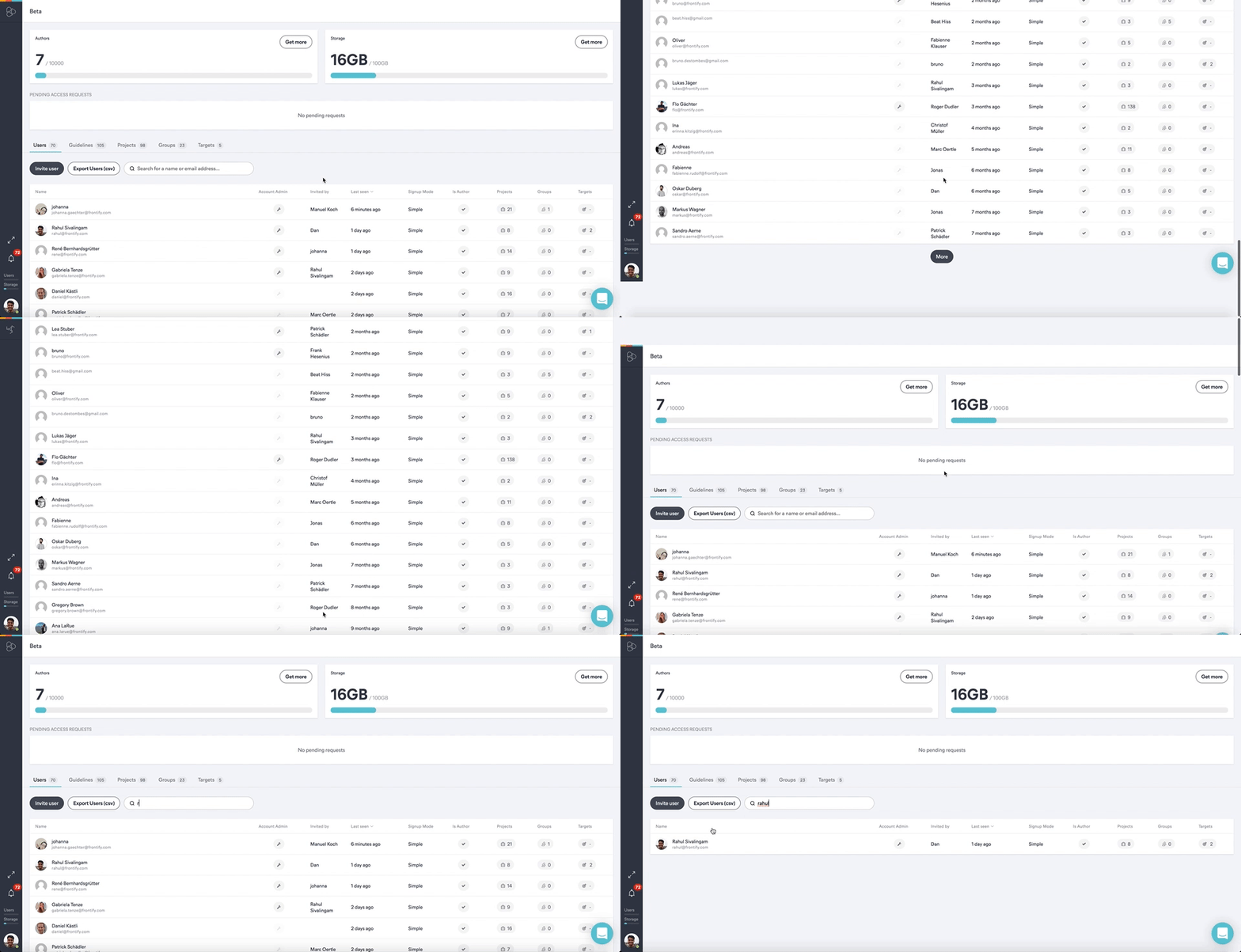
The user overview dashboard has been improved as well. From now on, there’s a search function filtering names or email addresses in the user list. Also, a paging mechanism has been implemented, where an additional bunch of users is loaded once you scroll down your user list. This results in increased performance of the whole usage page. Further, the sorting mechanism is improved. By improving the sorting mechanism – including a loading sign in case loading the page takes some extra time – you’ll be able to have a better interaction with the app. With this little mechanism, the blockage of the applications’ UI is eliminated – enabling you to switch between tabs while loading a certain page.
License Management
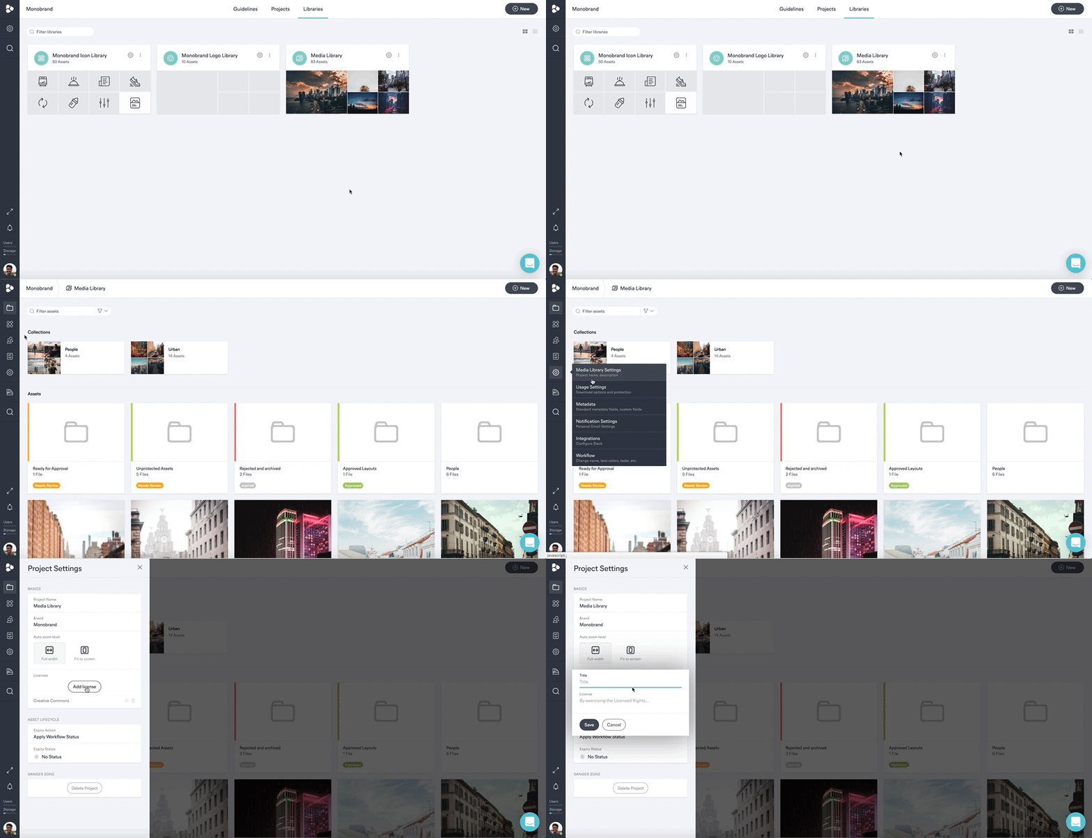
Previously, licenses could only be assigned to assets through bulk action. We added two new ways of defining licenses. Assign existing licenses to assets on the asset view level by switching to the metadata tab. To define new licenses, go to the respective Media Library project, and click on the settings cog wheel in your Power Bar > ‘Media Library Settings’ > ‘Add License’.
Image, Annotation, & Divider Block Improvements
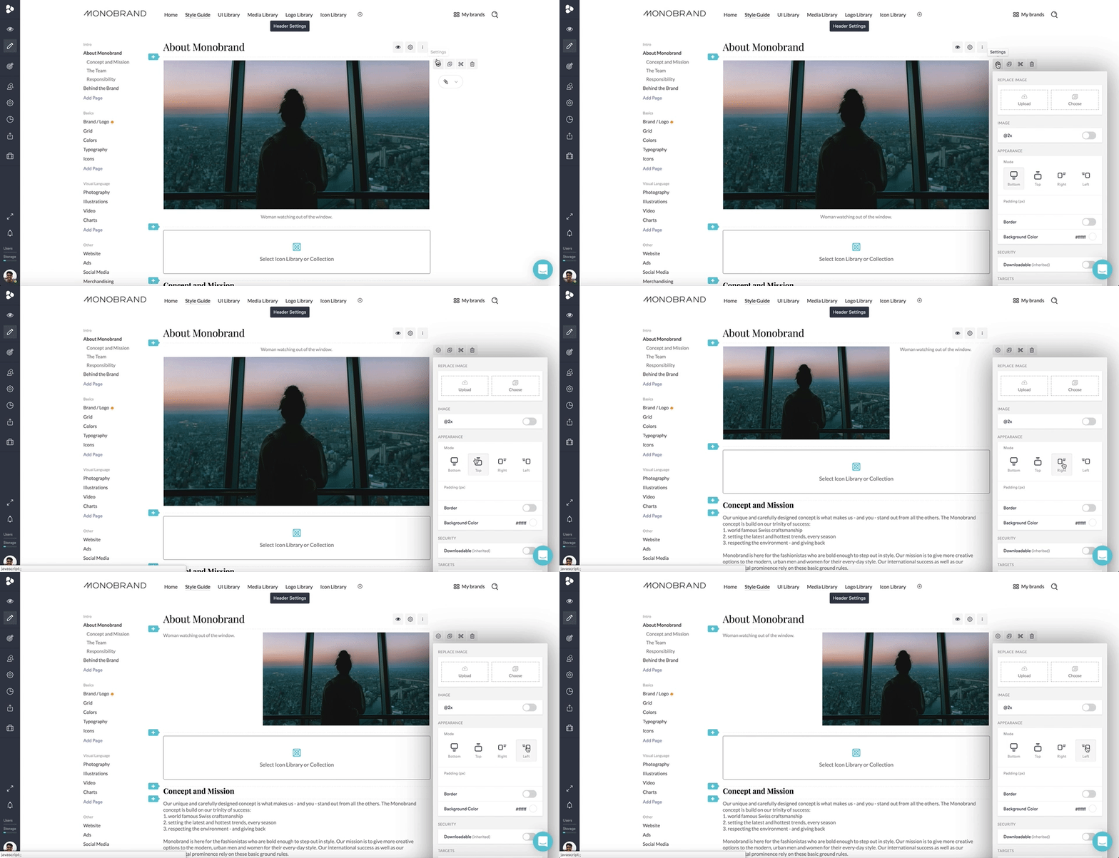
Several improvements were made within the Brand Guidelines. Change the positioning of the text description of your images, both in the image and annotations block. Let your specifications appear on top, bottom, left, or the right side of the image.
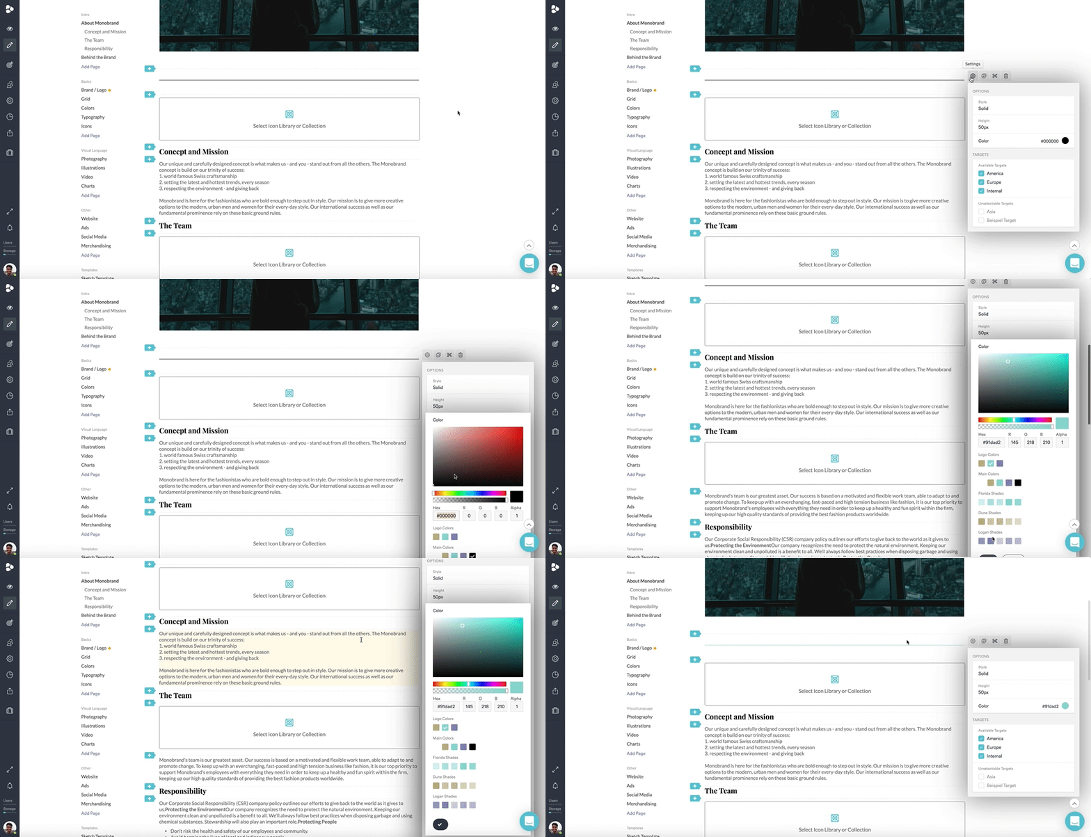
You can also change the style, height, and color of the divider to make sure it’s on-brand.
Block Action & Rich Text Improvements
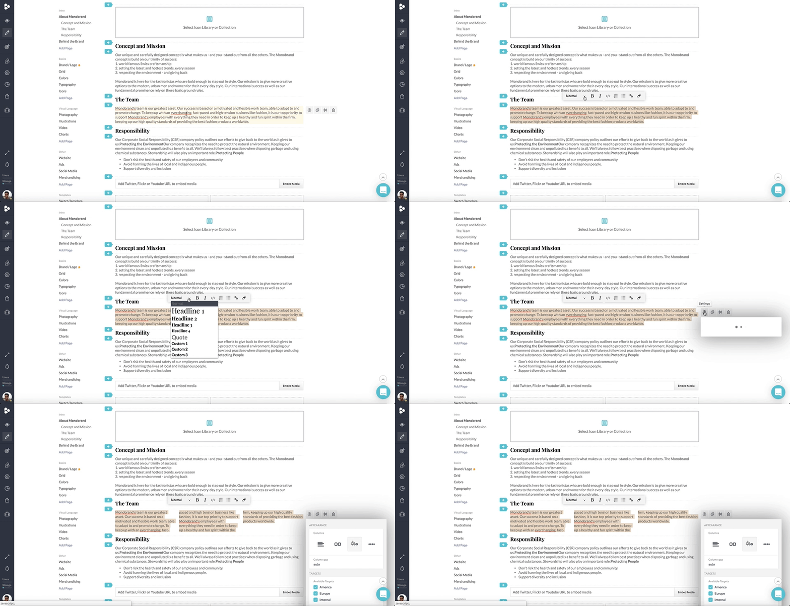
Block actions are now aligned and consistent throughout the entirety of the smart content blocks, removing minor ordering deviations and thereby providing a smoother experience. When using the rich text editor, you now have the ability to set up custom columns to fill your guidelines with content or embed the font styles defined in the general settings section, right into the single guideline blocks. This helps you retain consistency right from the start.
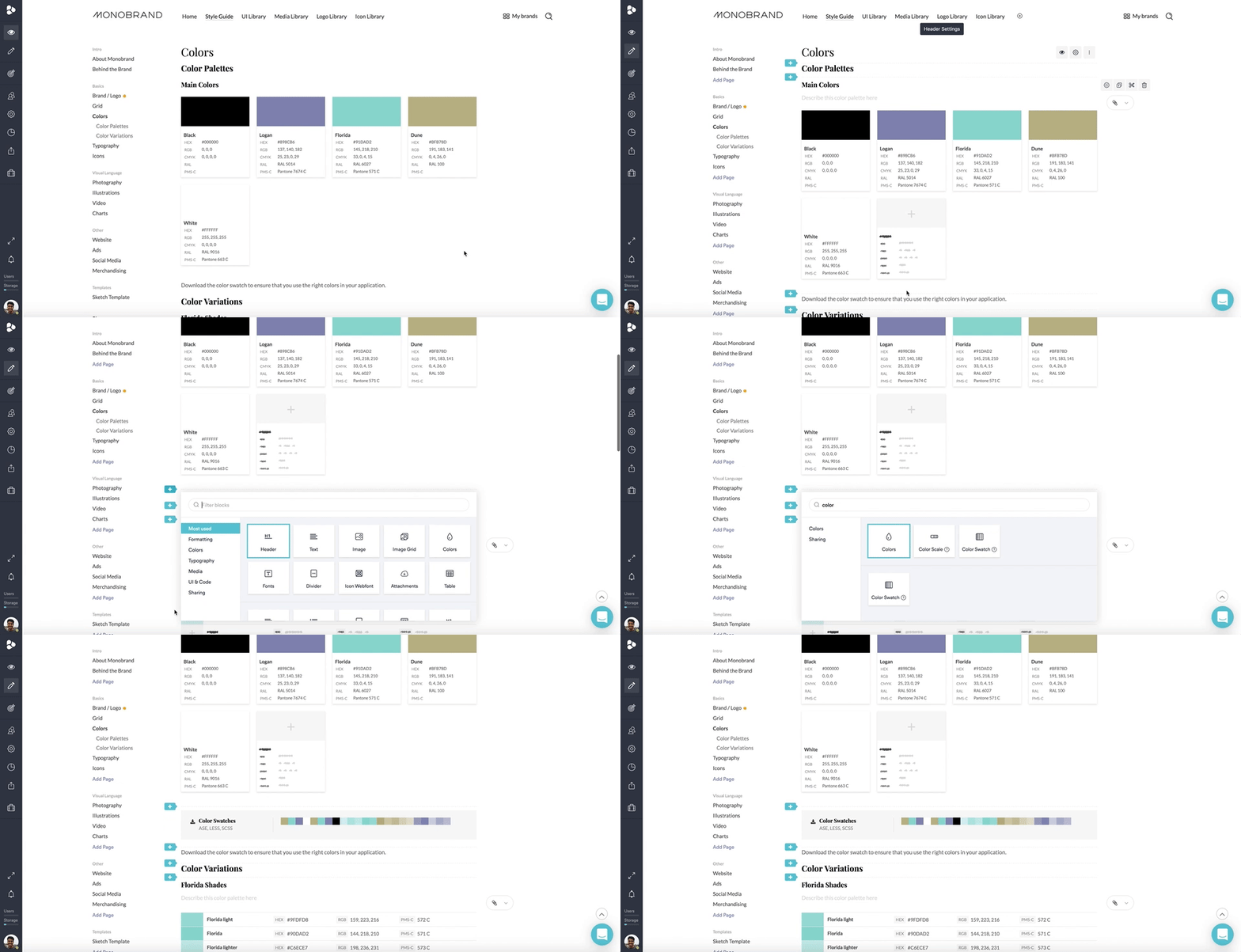
Search Smart Blocks
You now have the ability to search through the smart block options to add them. Once you’ve searched something, you can use the arrow keys to navigate between blocks and add them by hitting enter.
In addition to these product improvements, we also released some new features. The second part of the April Product Roundup will fill you in on those details. Check back for more soon.
Wondering about how all of these product improvements fit into the bigger picture? Check out our case studies for a closer look.
