Frontify is Where Brands Live
Every touchpoint and experience people have with our brand matters – especially when you’re the home for brands. So, we took ours back to the drawing board for a major rebrand, and we’re over the moon to share where we’ve landed. Now presenting: the brand new Frontify.
Can you relate to the feeling of everything and nothing changing, all at once? It’s maybe the best way to describe what it’s like looking back at where we started, and where we are today. Our business has reached incredible heights – more than we imagined, even – without losing sight of who we are and why we do what we do. We’re proud of that, and aim to ensure this is the case at all times; at any chapter in our brand story.
The big shift? Now, we have a brand that confidently showcases who we are and what we do with a look, feel, and tone that matches our beliefs, products, and aspirations. Most of all, our brand has the ability to shine a spotlight on the amazing brands we work with; because it’s really not about us at the end of the day – it’s about you and your brand.
Teamwork, Start to Finish
Far from a solo mission, we had a lot of creative help along the way. Renowned brand and design agency DesignStudio was a chief player in our rebrand, joining the project at its inception a little over a year ago. Through an immersive and wholly collaborative process of interviews, workshops, discussions, concepting, and iterations over countless hours of video calls (yep, this rebrand was 100% remote), together we were able to produce something really special; the foundation of our new brand.
Once we reached the point of handover, where all of those amazing foundation elements were defined, it was up to our internal team to continue the job and bring the brand to life. Spearheading production of a wholly new website was just one piece of the puzzle. We needed to adapt the Frontify platform environment, update all materials and digital channels, replace our signage, create new swag – everything but the kitchen sink, basically. As you’d imagine, not a quick or simple task. All hands on deck made this big rebrand possible, and we’re thrilled to be rolling it out to you.

New Strategy Vibes
If you caught our little teaser to our new strategy, including the Mission and Vision we’re so proud of, then you’ve already got a good sense of what our identity is built upon. At the core, we’re creating a home for brands to do their thing, and giving the people behind them the tools they need to succeed. We want to build engagement with everyone, across all roles, so absolutely each person that needs to shape, create, build, amplify, and share their brand can do so with our platform; anywhere, anytime, without barriers. This is critical to our beliefs and how we position ourselves.

To be our best, to really champion that philosophy, our hospitality and energy needed to shine through. So, we defined and documented our personality, beliefs, and behaviors in detail, solidifying these themes as pillars for expression. For instance, terms like vibrant, curious, and inviting (among others) have prominent positioning within our cultural characteristics – the effects of which can be seen throughout our comms, visuals, and interactions.
Fresh Looks, Deeper Meaning
You might’ve noticed our logo looks a lot different. That’s because our symbol has totally changed, and the typemark got a facelift, too. We refer to this new symbol as the nook. The nook has a special power and versatility that we’re especially excited about.
As an element of our logo, it represents the Frontify brand. It dances a line between 2D and 3D, creating a physical space with a floor and two walls – the place for brands to call home. This is a blank canvas, an empty area waiting to be filled.
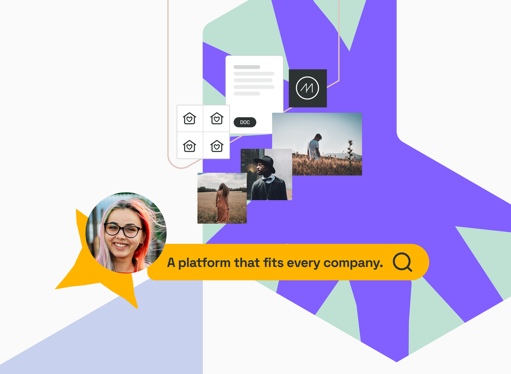
Additionally, it has great value and purpose as a chameleon element; absorbing (and displaying) visual elements of brands managed with Frontify. Every brand’s home in Frontify is unique and that shows in our own branding. We provide the structure, but it’s only when a brand brings their personality to the table that Frontify truly comes to life. So, things like color, pattern, and photography specific to those brands come in to fill the space.
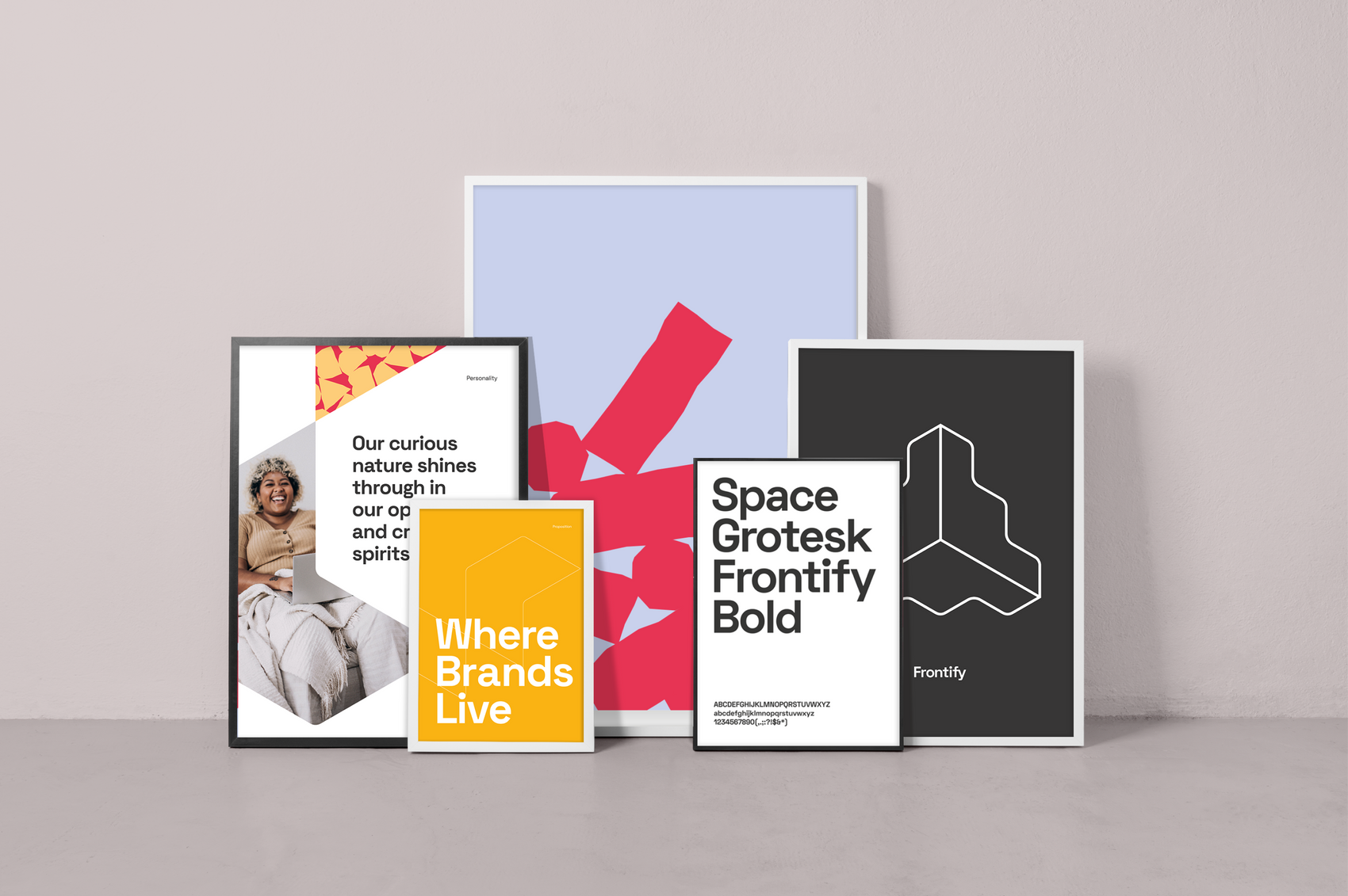
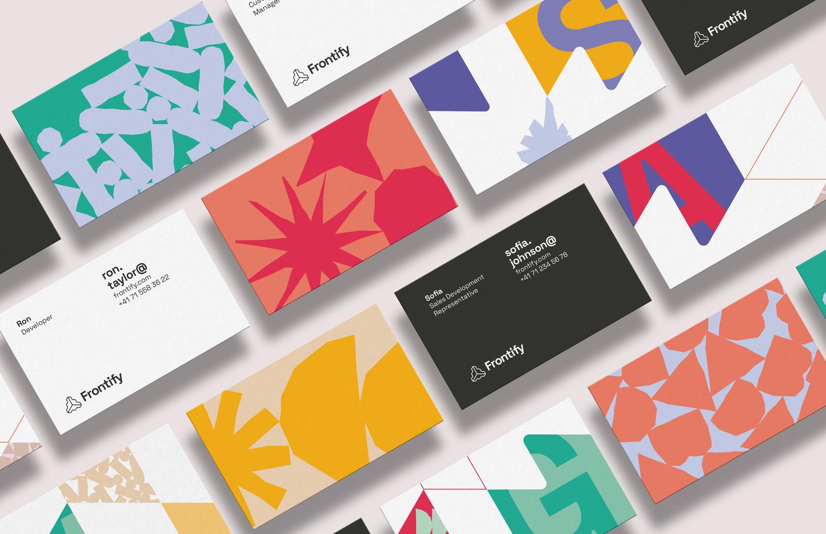
For our visual language overall, we’ve switched up our typeface, introduced patterns (each of those little shapes and elements you’ll see actually represents different brand components and assets), and offset our neutral primary color palette with bold, punchy accents.
We’re Not Done Just Yet
A brand is ever-changing, meaning that as our company evolves, so will our identity. Of course, this is true for any and all brands, so this idea of completion or finality isn’t really possible. As for the here and now with our rebrand, we’ve definitely covered the highest-visibility touchpoints and must-haves. There are still several items that need attention or a little reworking here and there – and that’s okay. These things take time, so as we move through the weeks and months ahead we’ll continue with the transition as we find our groove.

Further Rebrand Insights to Come
We know it’s not always easy to find behind-the-scenes information on what it’s like to go through a rebrand, the nuances and impact of such a major change, and honest conversation about challenges along the way – so we want to share that with you. If you’re ready to nerd out on rebrand processes, design system details, how our platform UI embraced the brand, and other nitty gritty moments, then keep your eyes peeled for further updates to come.
Until then, we hope you’ve enjoyed this first big reveal, and look forward to your feedback and thoughts on the road ahead.
