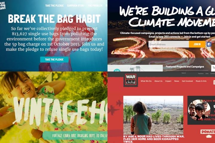
Design Round-Up: 11 Best Non-Profit Website Designs
Modern nonprofits know how significantly web design can impact donations, brand awareness, and a variety of other critical success factors. Responsive designs with mobile-friendly layouts encourage visitors to support nonprofits, all while quickly educating them on the cause.
Nonprofits need to have a very clear message that stands out and resonates with its supporters, and just as importantly, that message needs to be communicated accurately and effectively through their website. So if you're a designer in need of a little inspiration for your nonprofit clients, or you simply want to snag some unique web design tips from the nonprofit world, check out our roundup of the best non-profit organization sites.
Warchild
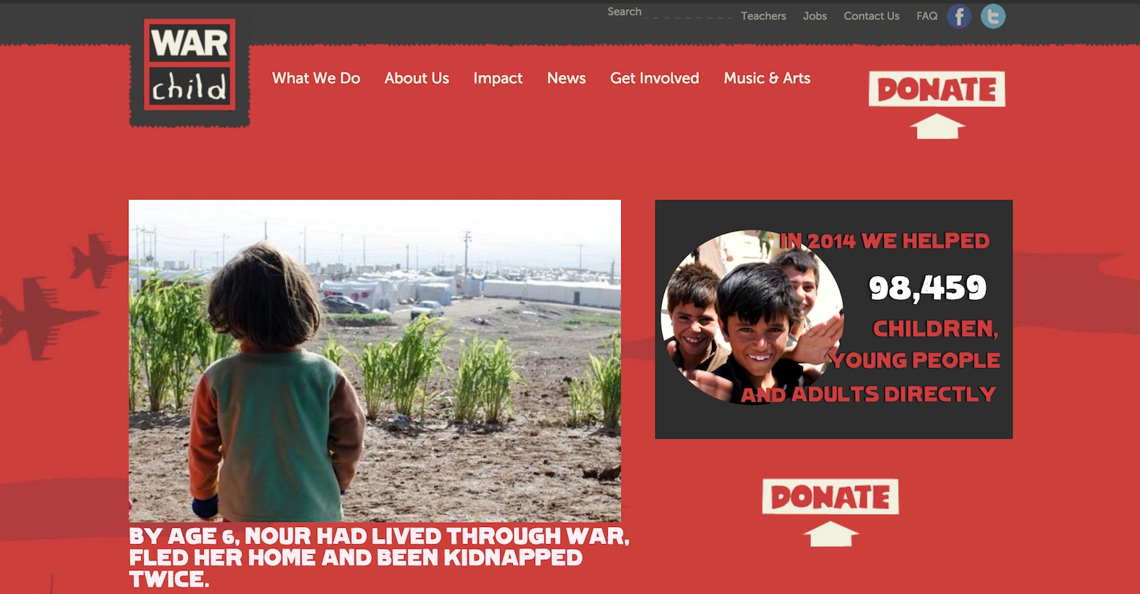
The idea of children living in the midst of a war is unfathomable for many people. War Child's web designer does a stellar job of educating visitors about this critical cause with photos and clickable headlines of children's stories of hardship. Scrolling down, you'll find powerful statistics, a tally of how many children War Child has helped, and a call to sign a petition. Clean and organized drop-down menus let you navigate this spacious website without getting lost in detail. The designer balances content on the seriousness of the issue with positive graphics on how visitors can help.
Break the Bag Habit
http://www.breakthebaghabit.org.uk
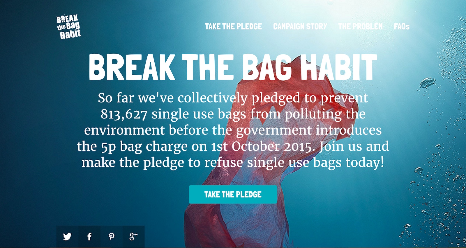
Break the Bag Habit is an organization that aims to reduce plastic bag pollution through education and a clear call to action. The site's design invites readers to take a powerful pledge and stop using plastic bags, which contribute to the pollution of coastlines, wildlife habitats, and and countrysides. While the initial idea is simple, the site adds appropriate detail with articles, art, and campaign updates. One useful feature of this design is how easily visitors can share their posts to Twitter. Their web designer, Andrew Couldwell, specializes in UX and has won several awards for his design projects. Couldwell has also worked with major brands like Livestrong and Red Bull.
Robin Hood
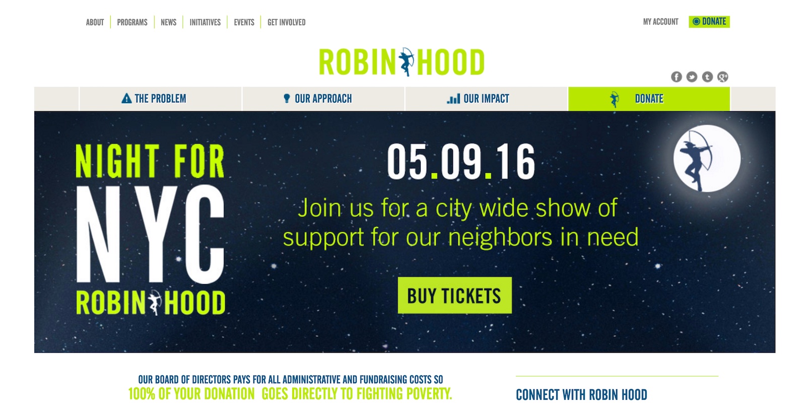
Robin Hood is an organization that addresses the complexities of poverty, highlighting factors that are often swept under the rug or misunderstood. This web design is crisp and vibrant with a blue and green color scheme. Videos are utilized frequently throughout the website, like the Robin Hood Unplugged series, which tackles heavy issues in an understandable format. The "Problem" page displays infographics that are stimulating, both visually and statistically.
Water for People
https://www.waterforpeople.org
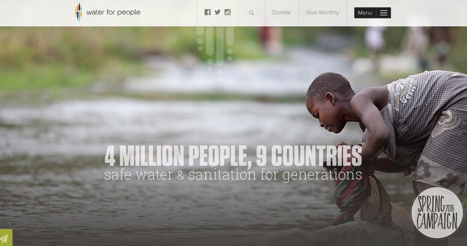
The first thing that catches the eye on Water for People's website are thought-provoking images of people accessing water around the world. The site’s unique menu can be fully opened to expand across the entire page. The web designer places the problem statement toward the top of the main page, and as you scroll down to it, all other content fades into the background. This is a wise technique for drawing complete attention to the problem statement, which is brief and direct.
DoSomething.org
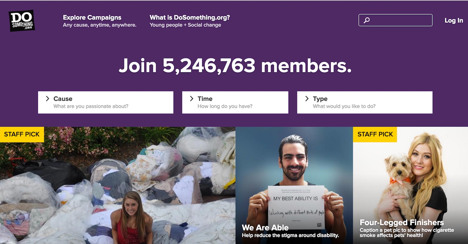
DoSomething.org’s call to action sits boldly at the top of the homepage, inviting visitors to join a group of over 5 million members. The front page also features the organization's latest campaigns, which empower young people to create social change in a variety of clever ways. This design makes social action accessible and customizes it to the preferences of their young, tech-friendly audience.
Slavery Footprint
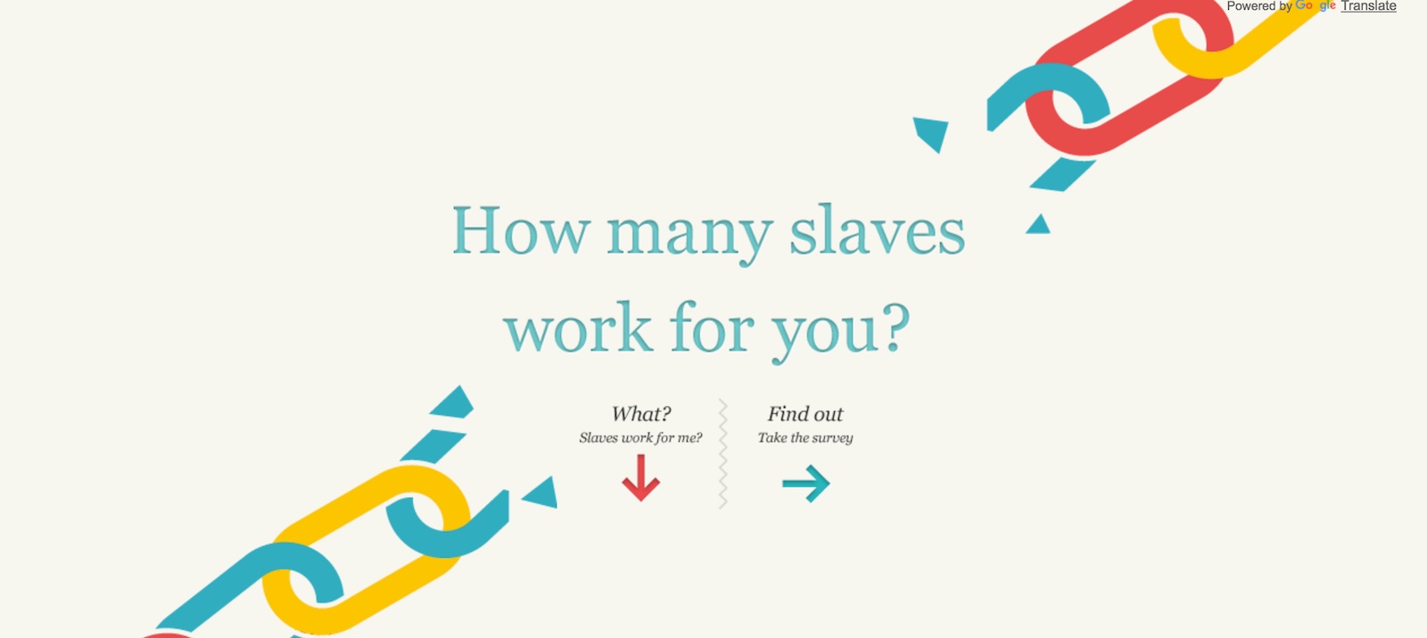
Slavery Footprint is an organization that challenges visitors to take an interactive quiz to determine the number of slaves that indirectly work for them. This incredibly eye-opening and sobering quiz tracks everything about your lifestyle, from where you live, to what you eat on a daily basis, with questions posed in an infographic style. Visitors can drag and drop icons to specify what kind of home they live in and what portions of different food groups they consume. Pop-up boxes alongside each question provide economic history and insight into the lives of slaves. San Francisco agency, MUH-TAY-ZIK HOF-FER teamed up with nonprofit, Call + Response, and production company, Unit 9, to create this highly customized quiz.
350
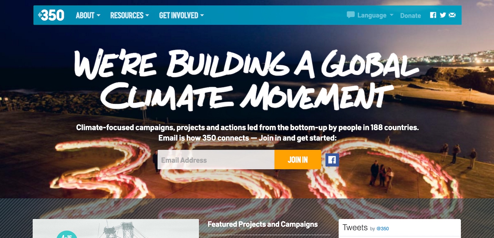
350 is a grassroots organization and comprehensive source for climate change information. The site is laid out to provide loads of information in an all-inclusive way. Visitors can watch videos, join global movements with the click of a button, and read about 350's climate change goals without being inundated with scientific jargon. The site also features a huge drop down menu of resources that appeal to a wide audience -- from those who are just learning about climate change, to those that want to jump into their next activist project. Visitors can access Facebook posts, blog updates, and topics by location and category, all from a list of tabs on the homepage.
Marseille
http://www.ateliersvilledemarseille.fr
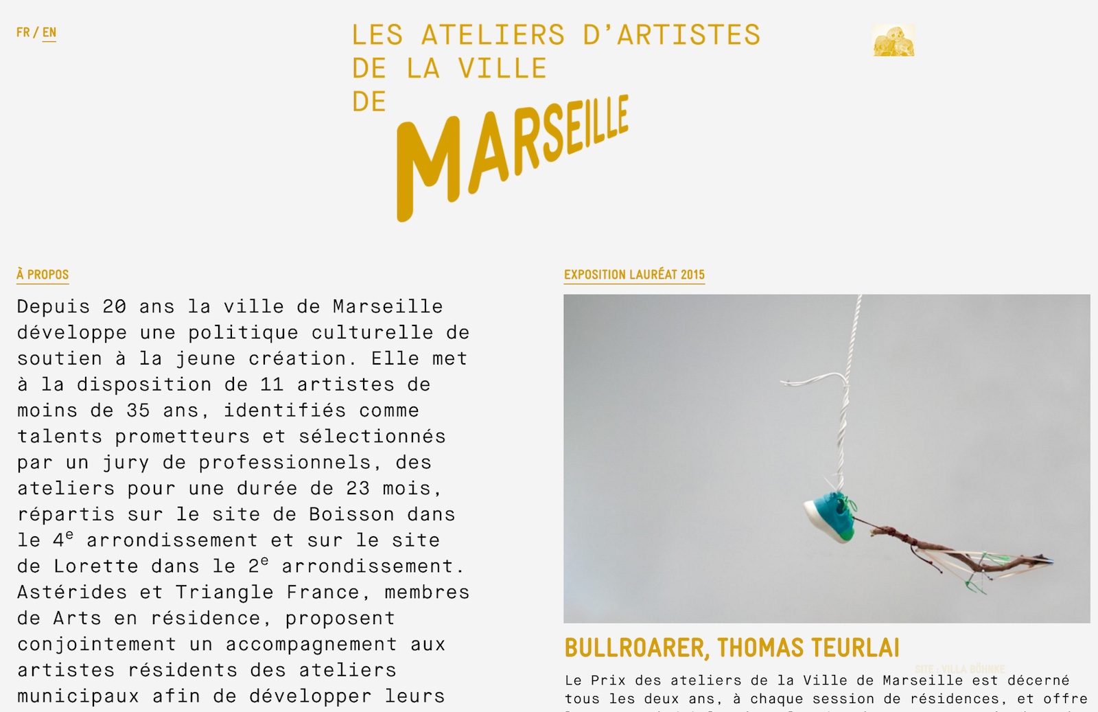
It may come as no surprise that a group of artists are breaking some design rules - but they do so in a way that’s artistic and intriguing. Marseille is a nonprofit studio based in France. Their unique font choice and slightly off-center alignment may at first fool you into thinking that minimal effort was put into this site. But with closer examination, there are some clever quirks to grab your attention. Upon each click of a small moving graphic at the top of the page, a different artistic display from the studio’s artists will expand across the screen for about three seconds. This feature gives an intriguing peek into the studio’s surreal designs.
Sierra Club
http://content.sierraclub.org/coal
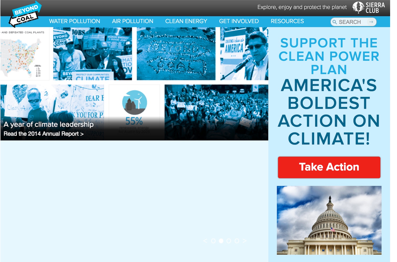
How does a web designer make coal interesting to its audience? This site does a brilliant job of showing just how many ways coal impacts pollution on our planet. A clean and simple sidebar invites visitors to "take action" to stop climate change, while a map shows how much progress the Sierra Club has made through tracking coal plants. This design does a particularly good job of emphasizing all the progress the campaign has made with a homepage slideshow of the latest news and a "Victories" infographic.
Vintage Hope
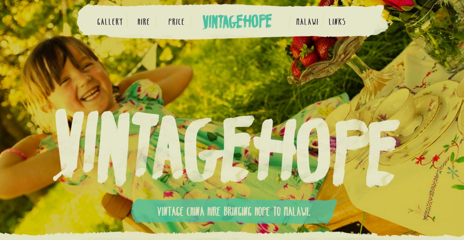
Perhaps one of the most visually beautiful designs of 2015 comes from Vintage Hope, an organization that offers fine vintage china at very low prices. Hire costs go directly to Tiyamike Mulungu, a southeast African children's home located in Malawi. Aside from the striking typography and vibrant images of beautiful china, the site's simple scroll-through layout gives you all the information you need in one shot.
Ambassadors for Life
http://www.ambassadorsforlife.org
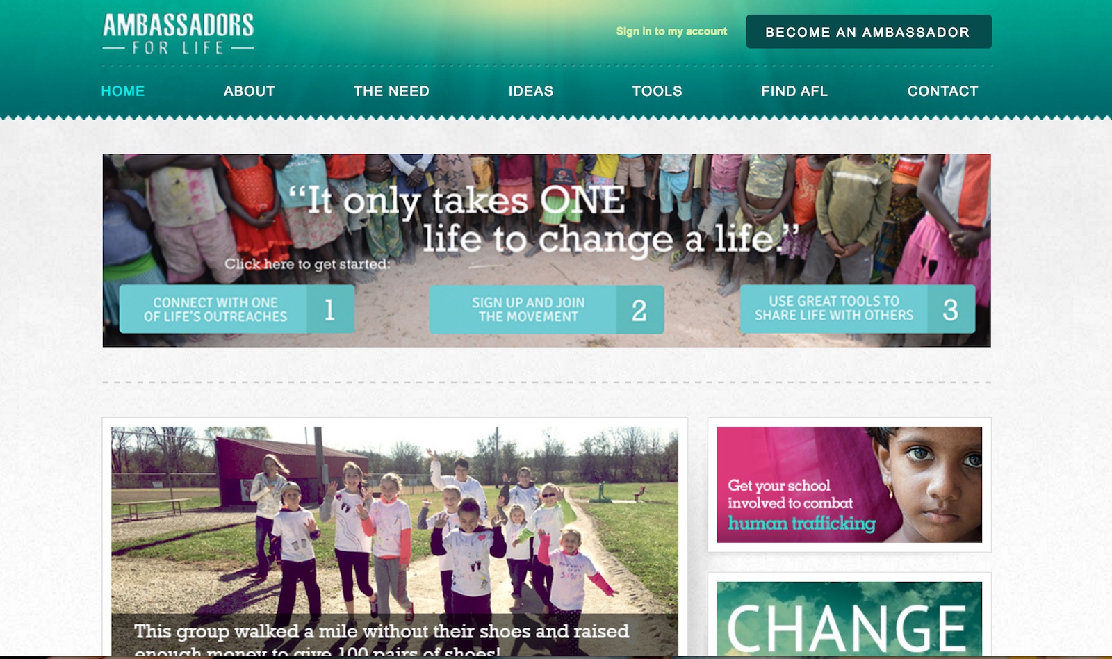
This design includes an immediate three-step call to action on the homepage. Throughout the site you’ll also find calls to action that are more meaningful and thought-provoking, like “Share life with others,” which invites visitors deeper into the ministry and purpose of the organization. A left-hand sidebar and top menu bar keeps navigation neat and organized, while also directing visitors’ eyes to the important call to action buttons. The site was designed by Church Media, a design agency that helps church and ministries with branding and design for both digital and print materials.
The most common theme in all of these sites is that donations are made easy. The less painful the process, the more likely supporters are to complete their donation form. Another common feature found in all of these designs is the intelligent and strategic placement of content - videos, staff bios, high quality photos, and articles help to stimulate visitors and discourage high bounce rates.
We saw subtle quirks, like Marseille’s tiny graphic that led to random studio art displays. We saw simple organization, like the streamlined navigation system at AmbassadorsforLife.org. Overall, these nonprofit designers demonstrate how weaving together various design components can synthesize a complete and effective website. Not only have they tapped into elements that audiences crave, but they’ve also taken full advantage of design as an instrumental branding tool. This is what earns them a spot in our roundup of the best.
So how can web designers define (or redefine) a nonprofit's brand - or any brand for that matter? One way to maintain consistency and personality for your brand is to create a style guide. By creating a style guide, you can select color schemes, fonts, logos, and other defining design factors that announce to your audience, "This is who we are."
