Product Roundup: Fall 2021
Bye bye sunshine, hello new products! It's time for our post-Summer Product Roundup. New apps, new integrations, and a whole load of improvements have been added to our platform to increase collaboration and keep those productivity levels up this Fall.
Here in Switzerland, summertime is behind us and our teams are winding down for the crisp Fall months. Despite the darker mornings ahead of us, our product is bright with shiny updates. From new integrations with design platform Figma to the launch of Webhooks to enable Developers more flexibility to build on top of Frontify – there’s so much to delight your teams with this season.
New Figma App
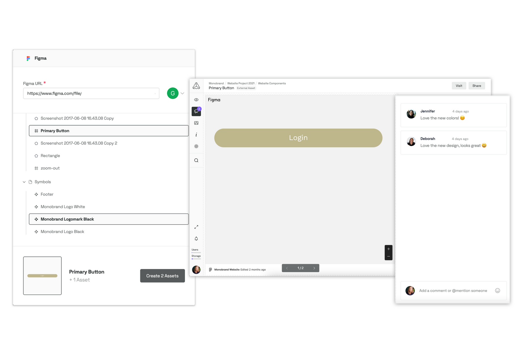
You may be wondering, 'Didn't we already have a Figma Plugin?' We still do, and you may access it directly through Figma and work with it there. The new Figma app, on the other hand, works within Frontify and allows you to bring in all your Figma design into Frontify.
Make Your Design Team Just That Little Bit Happier
This season we really wanted to build something that would make designers’ lives a little easier and, ultimately, create less feedback loops and more smiles within your teams. That’s why the Figma app's versatility allows everyone to view pages, components, and prototypes within Frontify projects by using a design URL, enabling collaborators to stay involved in the design process as well. Collaborators will be able to review these designs and offer input in Frontify without ever leaving the platform.
Clear Work From The Brand Managers’ Desk
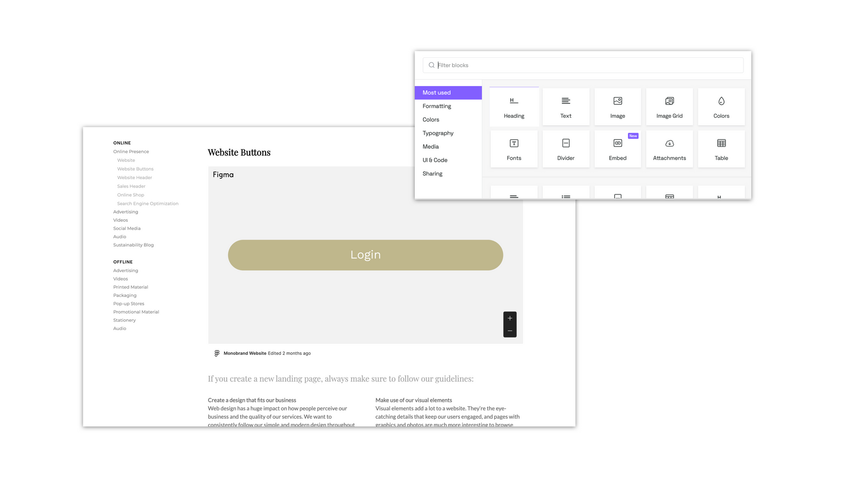
The new Figma app software also allows for faster and easier brand documentation. Once you've uploaded your designs, such as individual Figma components, prototypes – or even entire pages – to your Frontify Projects, they can simply be integrated into your Brand Guidelines. This way, what is modified in Figma will automatically be updated in Frontify. This is a short step that will save content creators and brand managers a bunch of time and allow designers to streamline their work processes, too.
New Integration With CELUM
After successfully partnering with CELUM, we now bring you our integration, which empowers our combined users and strengthens brand value. This connection is now available to all CELUM and Frontify clients who want to integrate their CELUM product-related assets into the realm of Frontify brand management. This ensures that your teams are constantly up to date with the newest product assets on the Frontify platform, ensuring brand consistency and always ensuring quicker material delivery to the various stakeholders.

Additions to The Developer Platform: Introducing Webhooks
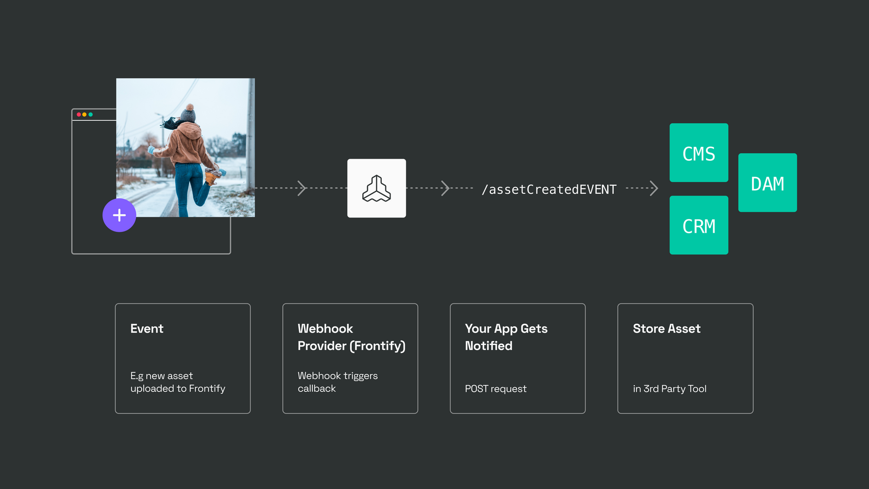
To the non-developers among us, Webhooks is one of many ways to enable different applications to communicate with one another. Essentially, this means that, with a little magic from your Dev team, many brand management processes can be automated. Webhooks provide a simple way for Frontify to speak to other apps, offering developers the possibility to start automating tasks, messages, assets, and much more. This capability helps you to stay on top of changes in Frontify and ensure that the correct course of action is taken, all with minimum effort and efficiency.
Updates to Platform Analytics: Location-based User Insights
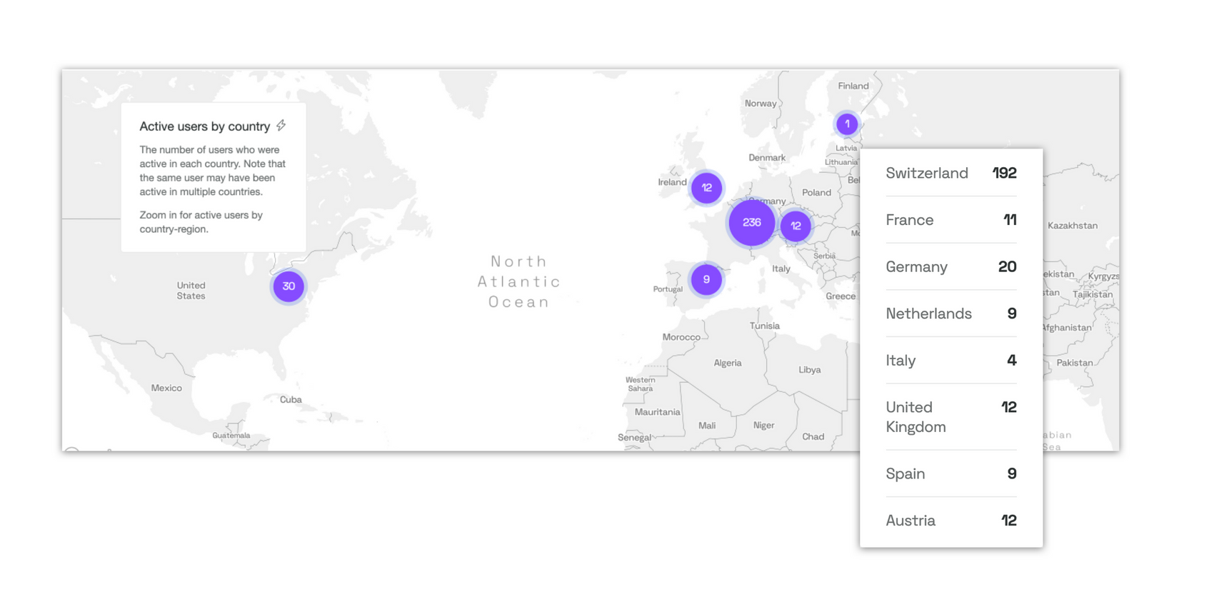
The analytics dashboard was upgraded with additional user insights based on their location. The map depicts the number of visitors based on their geographical location at a given point in time. That will help brand makers:
- Uncover valuable insights into user engagement with your brand to prove the effectiveness of brand activities.
- More insights into the distribution of users around the world, helping you identify additional opportunities.
- Target or optimize brand strategy, content, and operations around specific countries and regions.
The key features of the update include:
- Worldwide map overview
- Precise user location information (including their country and region)
- Visual representation of the number of users per area
- Insights available based on your desired time frame
Updates to Brand Guidelines: Improved Block Experience
Okay, so this one really will be news to you. This season we've also made plenty of exciting changes to our Brand Guidelines, taking customization and user experience to new heights. We will soon unveil a comprehensive redesign of our content block settings, enhancing the user experience for all editors and laying the groundwork for you to create Custom Blocks – all on your own.
Additional Content Block Improvements: External Link Icon Customization
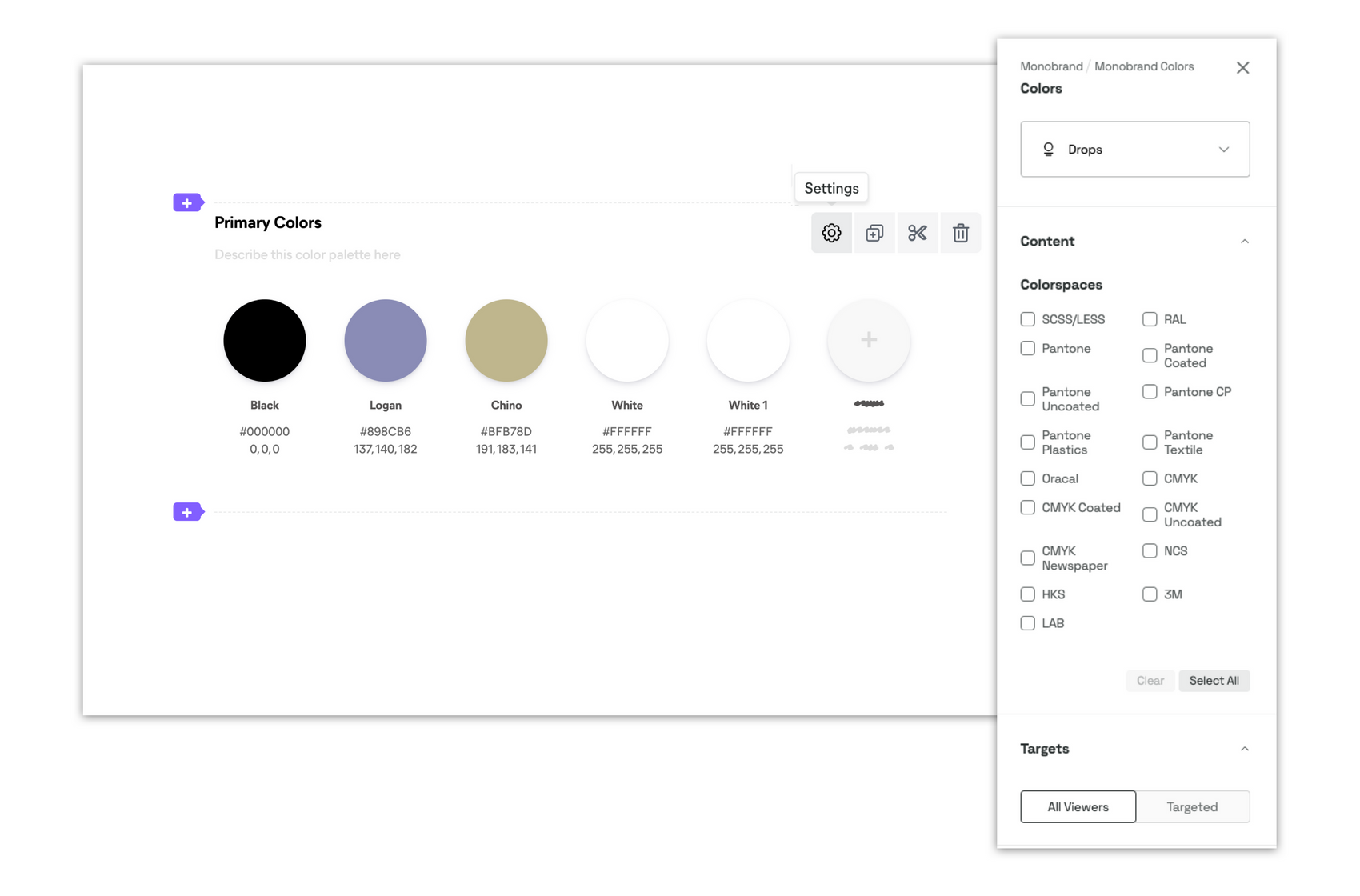
The improvements to your Brand Guidelines don't stop there; we've now included the ability to customize your navigation bar with “external link icons,” meaning that you can add your own, on-brand icons to add a little extra personalization to your brand home. This minor but important change equips you to include a bit of your brand into each and every touchpoint in your Brand Guidelines.
New In Our DAM: Download Protection Topic and Customization
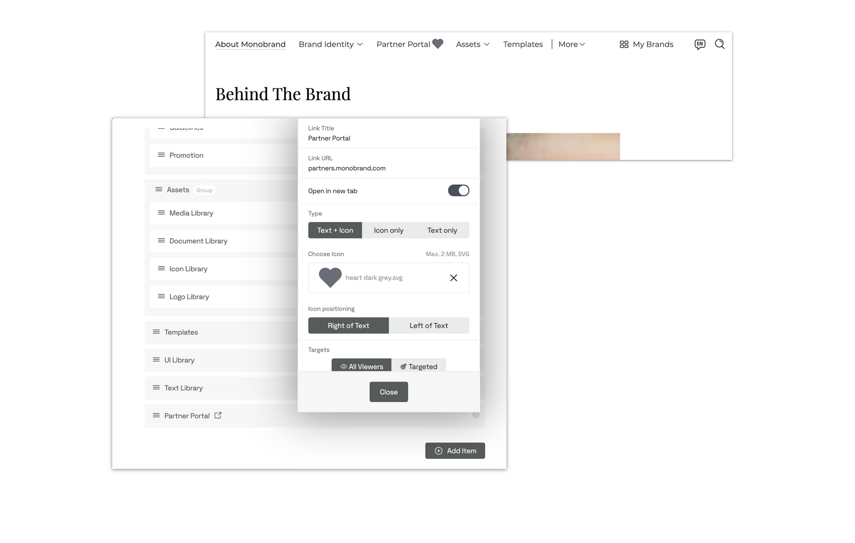
This quarter, we focused on improving the transparency of key library options and ensuring that customers had a clear experience when requesting asset downloads.
Asset Download Protection Sliders
The Media, Logo, Icon, and Document Libraries now provide clear Asset Download Protection settings as sliders that may be configured at the Library, folder, and asset levels. This will provide a clear picture of the level of protection and how assets are being utilized by consumers.
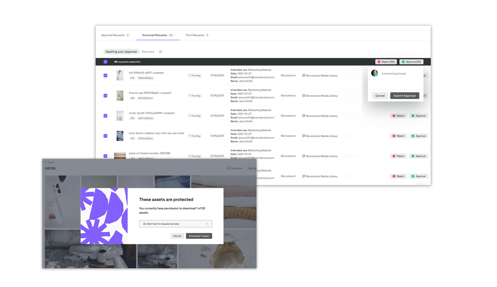
Enhanced Bulk Collection Download Requests
This enhancement also includes an optimized “Bulk Collection Download-request” experience – that means consumers of your assets are given clear indicators of how many assets in a collection may be downloaded and which can be requested. Additionally, request reviewers are better able to accept or reject assets on the review dashboard, allowing for quicker approval timelines and delivery material.
Increased Collection Customization
We also worked hard to expand the customizing possibilities for your library. There are now more sorting options for collections in the frontend and backend of your libraries, as well as within an asset collection. This will allow you to concentrate solely on collection organization and asset discovery.
Improvements to Template Image Alignment
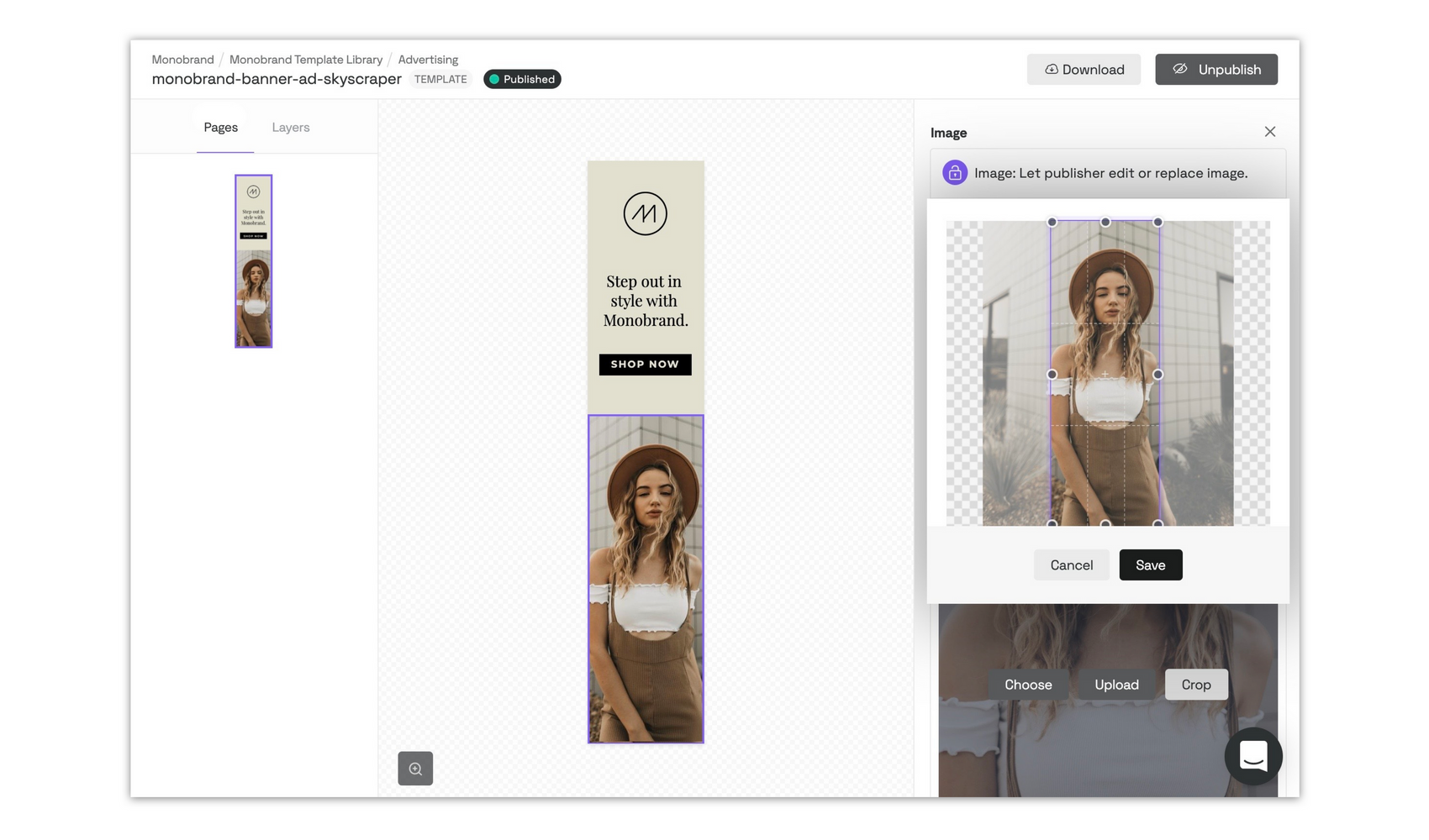
Another one to make the designers happy – we also focused on giving template builders more options this quarter, and added methods to make the template creation process more efficient. Previously, designers had to continuously edit and crop pictures before adding them to templates. It was the only way to get them to fit exactly into the appropriate position. With new cropping enhancements, you can simply substitute a picture and the cropping area will be adjusted to measurements in the template space; all that remains is to move the cropping ratio.
Oh, and, since you got all the way to the end of this article, we assume you’re a product fanatic. You’ll probably enjoy the additional product updates in our weekly release notes and our Product Newsletter.

