HolidayCheck Style Guide
It's the small things that make a style guide special. As guidelines might be dry sometimes (it helps to make them interactive), I like the humorous way to explain stuff and the funny little notes which are spiked throughout the HolidayCheck style guide
About HolidayCheck
Together with his colleagues, Josip Kristo (Lead Designer @ HolidayCheck) has built this awesome style guide for their company. Holidaycheck is the largest review communitiy of hotels (and other holiday related services) in the German speaking area of Europe.
Back in 1997 when they started, HolidayCheck has had a website where the community could exchange their hotel experience with other members. Since then their offer has expanded and so the touchpoints for their users. Today HolidayCheck wants to keep the brand consistent across all the channels. The user experience should be the same whether the users reads ratings on the website or on their apps.
When I first talked to Josip I was really excited that HolidayCheck wanted to try Frontify. First, their brand is well known around here (when I drive by their headquarter I can't deny that it makes me a bit proud), secondly, I mean, how cool is that? Having someone using your product is already cool. But if this person shares also your name, that's really awesome! So they've been working already with Frontify Workspace and we've been talking about possibilities to document their UI. Back then, we haven't released Frontify Style Guide to the public yet and were glad to have someone like HolidayCheck in our private beta. Despide the beta status, HolidayCheck was convinced what they saw and what was possible so they decided to use Frontify to document their design & User Interface.
Digging in to the Style Guide
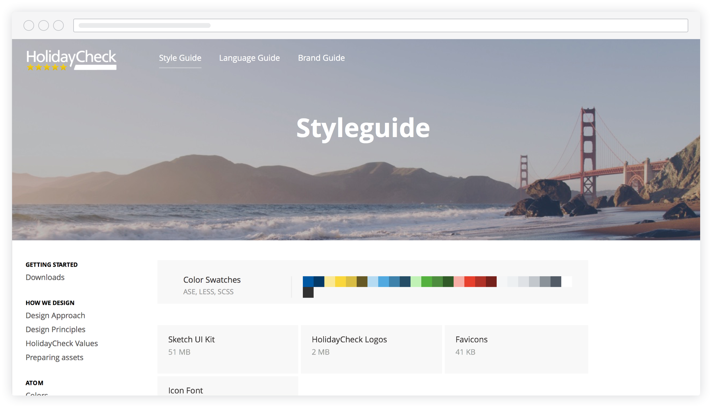
Instead of providing a welcome message and lenghy explanations, (I guess everybody knows what a style guide is for in their team), they start right of with the most used assets: color swatches & UI patterns. Those assets are generated automatically by Frontify, so that if changes occur, these downloadable assets are always up to date.

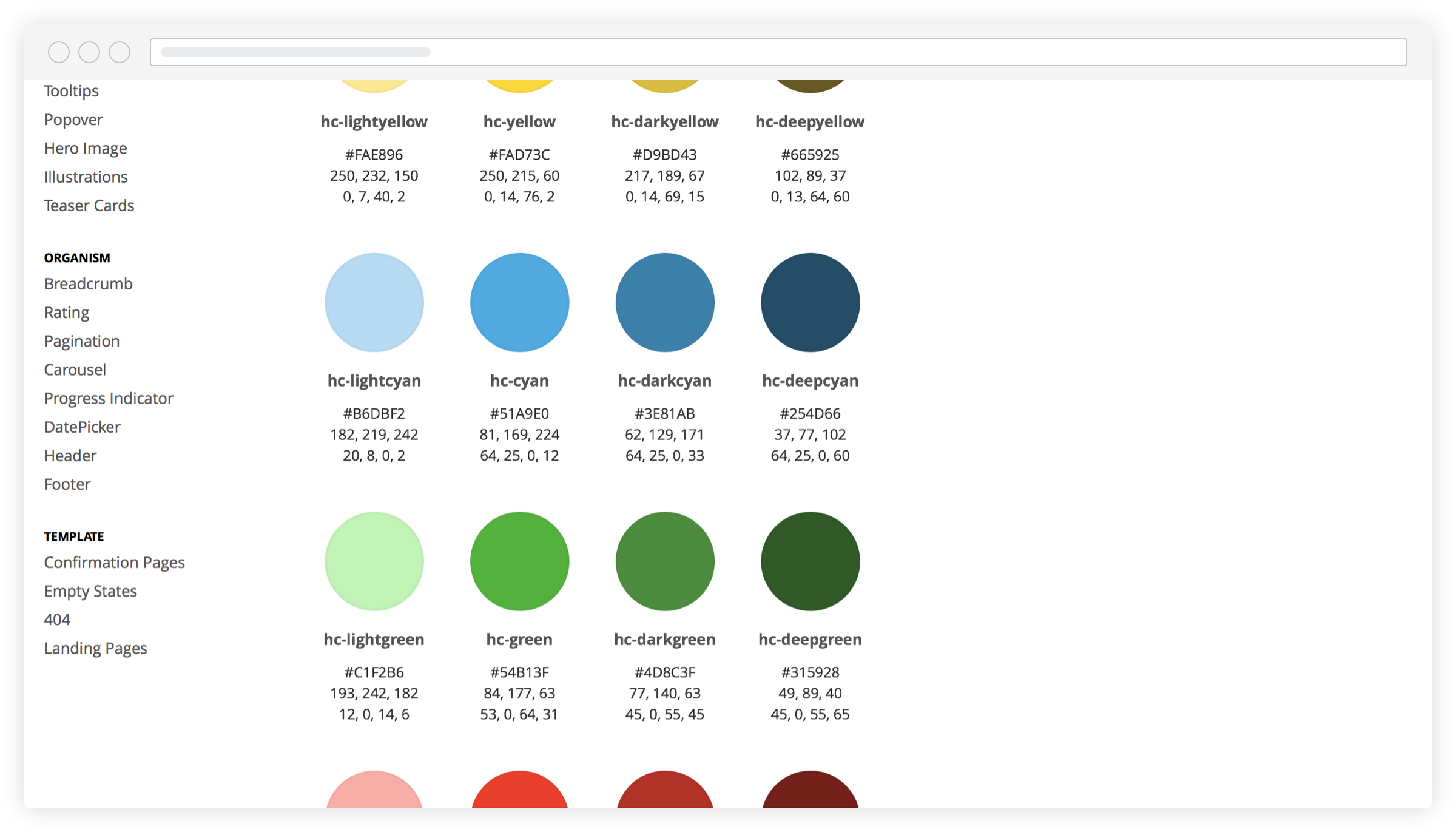
As you know, I love colors. Especially when they're neat and tidy like in the screenshot above.

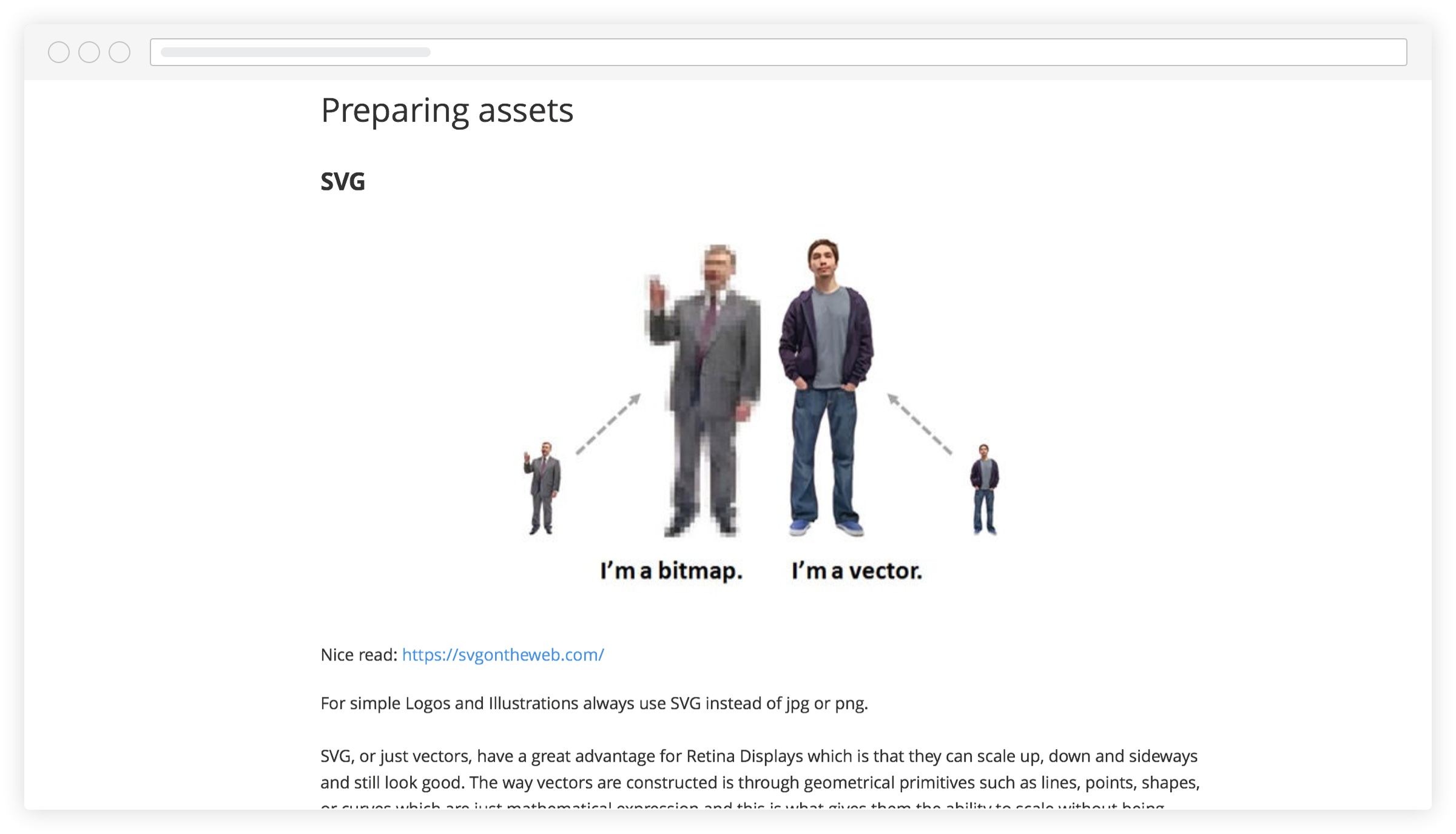
What I like about those guidelines is that they don't simply show you what's right and wrong. Moreover they they explain you with pictures the difference and show you with additional material and templates how something can be done right according to their brand guidelines.

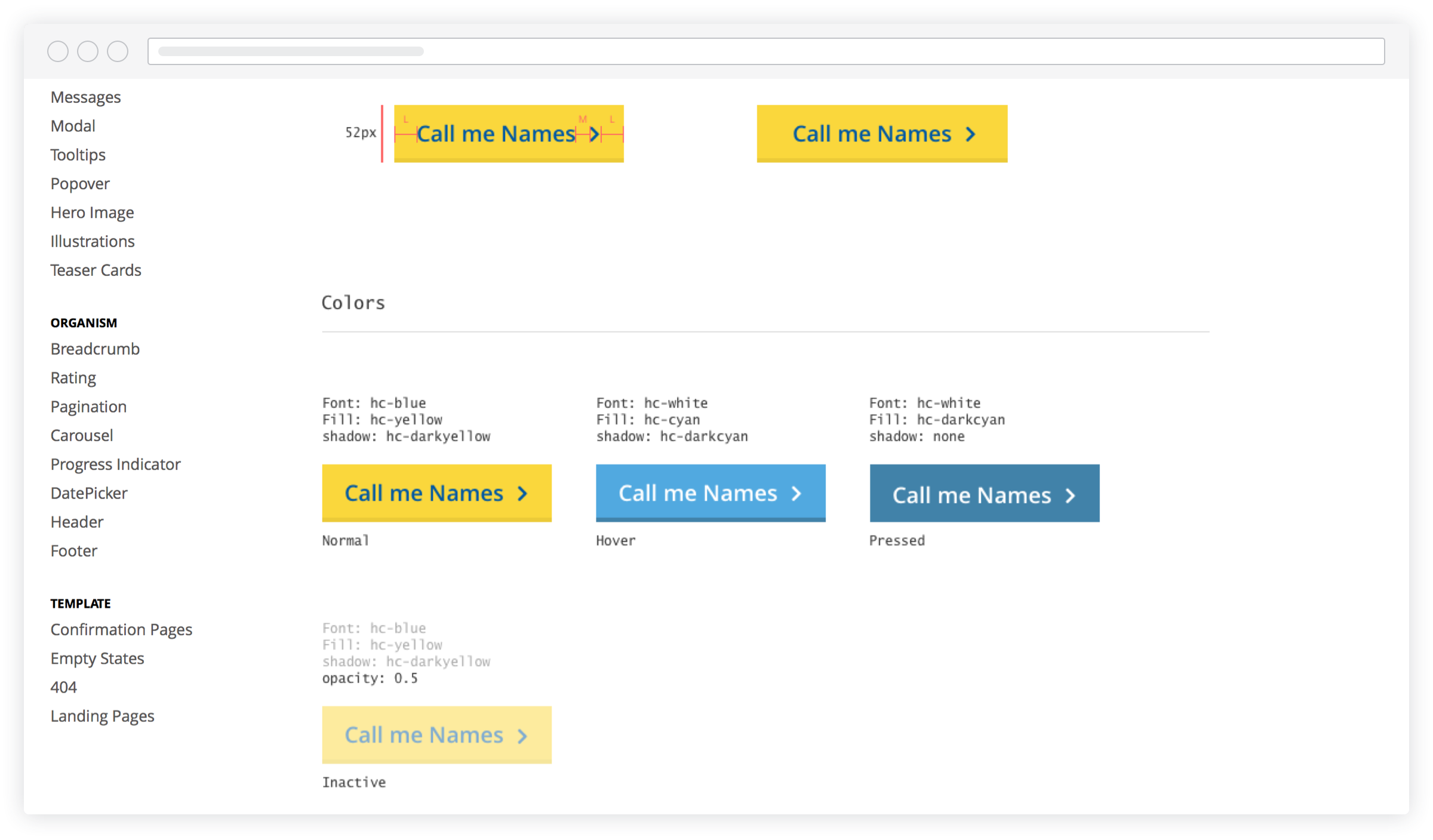
It's the small things that make a style guide special. As guidelines might be dry sometimes (it helps to make them interactive), I like the humorous way to explain stuff and the funny little notes which are spiked throughout the style guide, such as the buttons. =)

Conclusion
Overall Josip & his friends have created a very diverting as well as intuitive style guide. People can find what they need even without using the search. There are companies which suffer from low compliance to guidelines. However I'm convinced HolidayCheck isn't one of them, not only because it's well structured, but also because of their humorous way to explain how to work with their brand.
