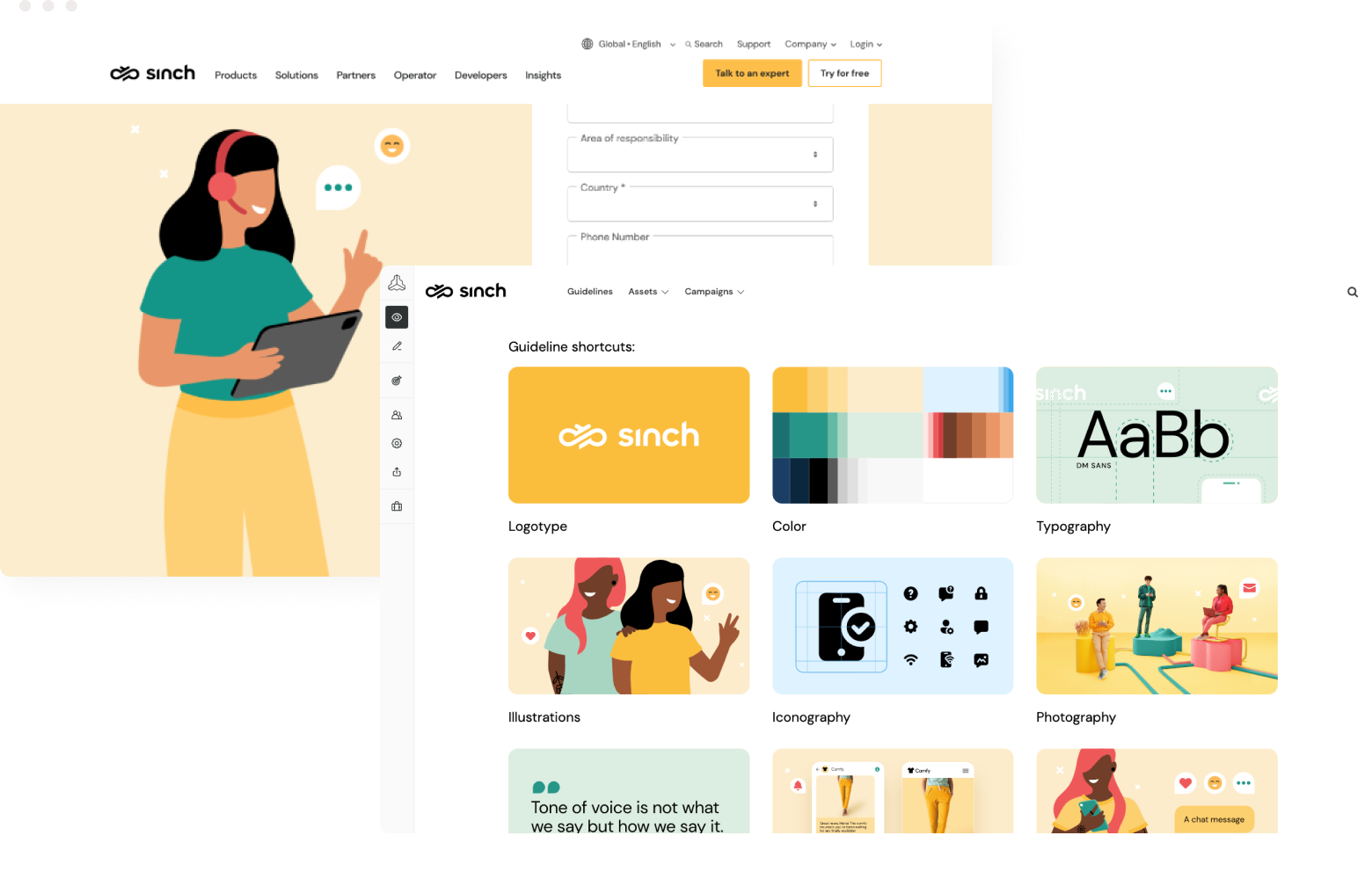
Digitale Markenrichtlinien
Markenrichtlinien können ganz unterschiedlich umfangreich sein und von wenigen Seiten bis zu einigen hundert reichen. Für alle gilt jedoch, dass sie umfassende Informationen dazu enthalten, wie eure Marke repräsentiert werden soll – in Wort, Schrift und Design.
Key takeaways covered in this guide
-
Digital brand guidelines are essential for maintaining brand consistency across digital platforms, offering easy-to-use, shareable, and updatable rules that integrate with your broader software ecosystem and support efficient collaboration.
-
PDF brand guidelines, due to their static nature, difficulty in updating, lack of interactivity, and accessibility issues, are becoming obsolete
-
Frontify enables brands to create dynamic, customizable digital brand guidelines that foster community, ensure consistency, and facilitate seamless updates and expansions.
Eure Richtlinien – euer Style Guide, Markenhandbuch oder Markenleitfaden – enthält grob gesagt alle Standards, die die Repräsentation eurer Marke regeln. Für Marken, die mit verschiedenen Teams und externen Beteiligten zusammenarbeiten, ist die Bereitstellung von Markenrichtlinien die einfachste und effektivste Methode, um Markenkonsistenz an allen Kontaktpunkten zu gewährleisten – und ein ansprechendes und einheitliches Kundenerlebnis zu schaffen.
Wenn ihr eure Markenrichtlinien, oder auch Brand Guidelines, gestaltet, solltet ihr zunächst auf die Kernwerte eurer Marke eingehen, bevor ihr eure visuellen Komponenten näher beschreibt. Als Einführung bietet es sich an, die Mission eurer Marke, eure Markenidentität und euer Markenversprechen vorzustellen. Ziel ist es, den Leserinnen und Lesern zu vermitteln, für welche Werte euer Unternehmen steht, und die nachfolgenden Richtlinien für visuelle Inhalte in einen breiteren Kontext einzubetten.
Eure Markenrichtlinien sollten mindestens Informationen zu folgenden visuellen Komponenten enthalten:
- Das Logo: Erklärt, wofür euer Logo steht, in welchen Versionen und Größen es verwendet werden darf und inwiefern es in Weißraum einzubetten ist. Gebt Beispiele für die richtige und falsche Verwendung – etwa in Form von Dos and Don‘ts.
- Schriften: Welche Schriftarten verwendet ihr in Webinhalten, welche in Print-Content? Häufig wird auch für Überschriften eine andere Schrift genutzt als für den Haupttext.
- Markenfarben: Untergliedert diese gegebenenfalls in Primär- und Sekundärfarben und gebt eure Farbcodes für Pantone, RGB und/oder CMYK an.
- Anwendungsbeispiele Zeigt, wie all diese Komponenten ideal zusammenwirken sollten. Wählt dazu am besten ein paar Beispiele aus euren Anzeigen, eurem Web-Content, Büromaterial etc. aus.
Damit wäre der Grundstein für eure Richtlinien zur visuellen Sprache eurer Marke gelegt. In detaillierteren Richtlinien werden auch Aspekte wie Markenmuster, Bildsprache und Illustrationen sowie Bildmaterial und Videoinhalte erläutert, sprich weitere Komponenten, die genutzt werden, um eure Markenbotschaft nach außen zu tragen. Um die visuelle Präsenz eurer Marke möglichst effektiv zu kommunizieren, sollten eure Richtlinien ebenfalls im Stil eurer Marke gehalten sein.
Gute Beispiele hierfür wären unter anderem die Markenrichtlinien von TikTok, Alpine, Google und Beyond Gravity. Diese könnt ihr, wie viele weitere auch, online einsehen.
Bleibt noch die Frage des Formats – und die Frage, ob sich das PDF-Format wirklich eignet. Ist es nicht umständlich, mit statischen Dokumenten und unzähligen archivierten Ordnern zu arbeiten? Wäre es nicht viel praktischer, Richtlinien digital bereitzustellen, sodass alle jederzeit und von überall aus auf sie zugreifen können? Wäre es nicht einfacher, man könnte Richtlinien zentral aktualisieren, sie für alle Geräte, einschließlich des Printformats, optimieren und je nach Standort direkt in der richtigen Version und Sprache anzeigen lassen?
Eine Software wie die von Frontify kann euch genau diese Vorteile bieten. Findet alles auf Anhieb und ladet gewünschte Brand Assets mit nur einem Klick herunter, statt wertvolle Zeit darauf zu verwenden, unzählige Ordner nach den gewünschten Markenelementen zu durchsuchen. Zukünftig werden Marken ihre Werte vielleicht ein wenig offener kommunizieren und ihre Richtlinien (oder zumindest Teile davon) veröffentlichen, solange sie noch Gültigkeit haben. Alles das ist zum Greifen nahe und wird Design-, Marketing- und Entwicklungsprofis das Leben sicherlich sehr viel leichter machen.
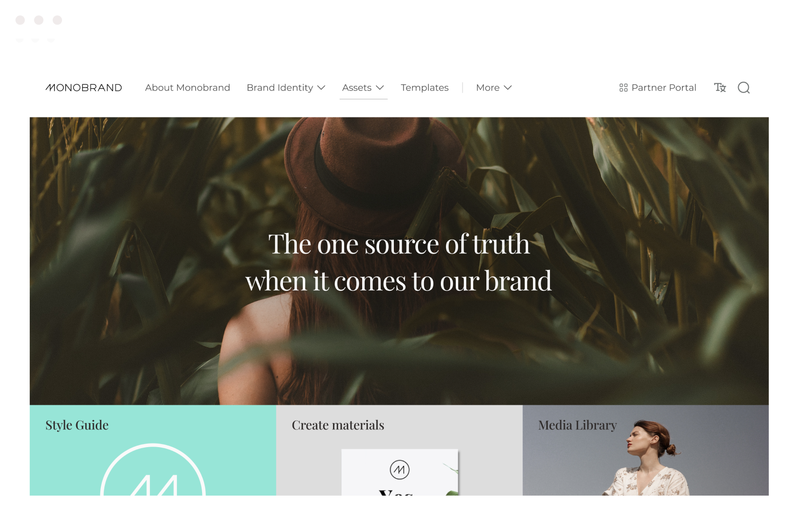
Why PDF brand guidelines (really) aren’t the best
Although they might make a beautiful coffee table book the two days they’re up-to-date, or act as perfect fuel for kindling an actual fire, PDF brand guidelines are no longer enough in a digital world and are therefore oftentimes ignored. It’s time to ditch them. Here's why.
- They’re not interactive: PDF guidelines are static documents that offer limited interactivity. They don't provide an immersive experience or interactive features that can enhance understanding and engagement with the guidelines. This makes it challenging for users to grasp and apply the brand.
- They’re hard to use: PDFs don’t provide a user-friendly experience. They can be challenging to navigate, search, and find specific information quickly, making it difficult to reference and share specific guidelines with team members or externals. It kills collaboration and slows down your workflow.
- They might be outdated:PDF guidelines can quickly become outdated as your brand evolves or you accidentally send everyone the one with a typo on page 23. Once a PDF is created, updating and distributing the revised version becomes cumbersome, time-consuming, and sometimes expensive.
- They’re not accessible:PDF guidelines often reside in a small silo within a company, accessible only to a select few. This can hinder widespread adherence to your brand book throughout the organization, making the brand a lot weaker than it could potentially become.
- They’re expensive:Creating or updating PDF brand guidelines can be quite costly, mainly due to expenses associated with hiring creative agencies (for each little fix) or dedicating valuable internal resources (people and time) that could’ve been better used elsewhere.
Digital brand guidelines, with their interactive, linkable, up-to-date, and user-friendly nature, offer a more inclusive and effective approach to safeguarding and promoting brand consistency throughout an entire organization in our digital landscape.
7 Benefits of online brand guidelines
It might go without saying, but digital brand guidelines actually offer several advantages over outdated PDF brand guidelines. Here are our top 7 (talk to your creatives for the full, easily imagined list of 267).
-
Accessibility and availability: Up-to-date versions of digital brand guidelines can be accessed by anyone with an internet connection (or can be downloaded into a PDF if you’re really going off grid), making them readily available to employees, external partners, and stakeholders worldwide.
-
Interactivity and engagement: Digital guidelines are interactive, allowing the user to be a participant rather than a consumer. This increases engagement and understanding, making it easier for users to explore different sections, quickly find the information they need, and understand it.
-
Easy updates and version control: Updating digital guidelines is significantly easier compared to PDFs. With digital guidelines, changes and updates can be made in real-time, ensuring that everyone has access to the latest information, reducing the risk of teams using old guidelines.
-
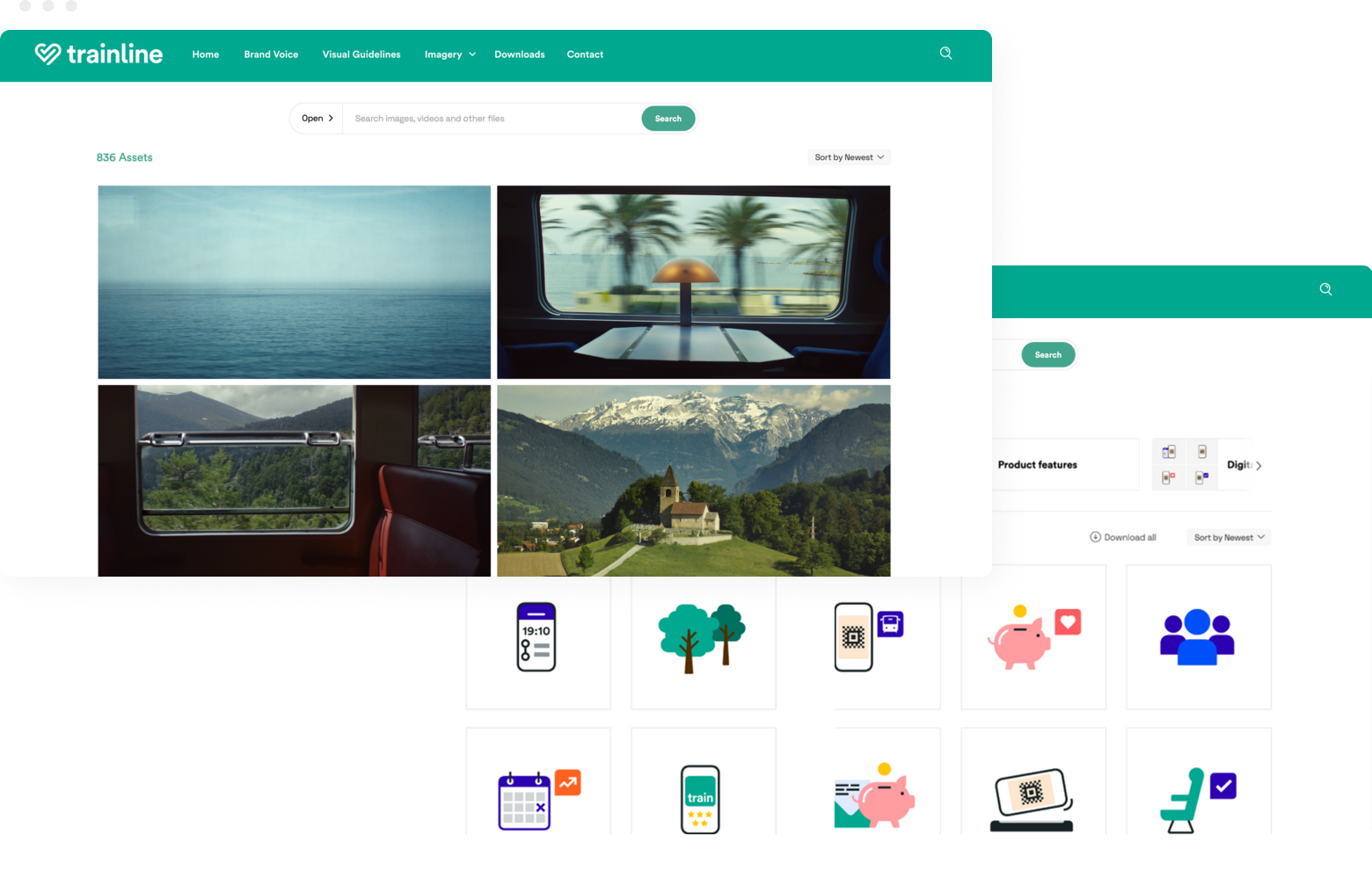
Searchability and navigation: Digital guidelines often have user-friendly interfaces, intuitive navigation menus, and search functionality. Users can easily search for specific terms, topics, or elements, saving time and effort while improving efficiency and productivity.
-
Platform integration: Digital brand guidelines should allow for a direct connection to your digital assets (DAM), as well as ecosystem integrations to your creative and/or operational software. This allows for a more unified brand experience that doesn’t get siloed in with a single team.
-
Collaboration and sharing: Digital guidelines facilitate collaboration between teams, internal or external, ensuring that everyone is on the same page, always. Being easily shared and simultaneously worked on by different people, they allow for seamless feedback and discussion.
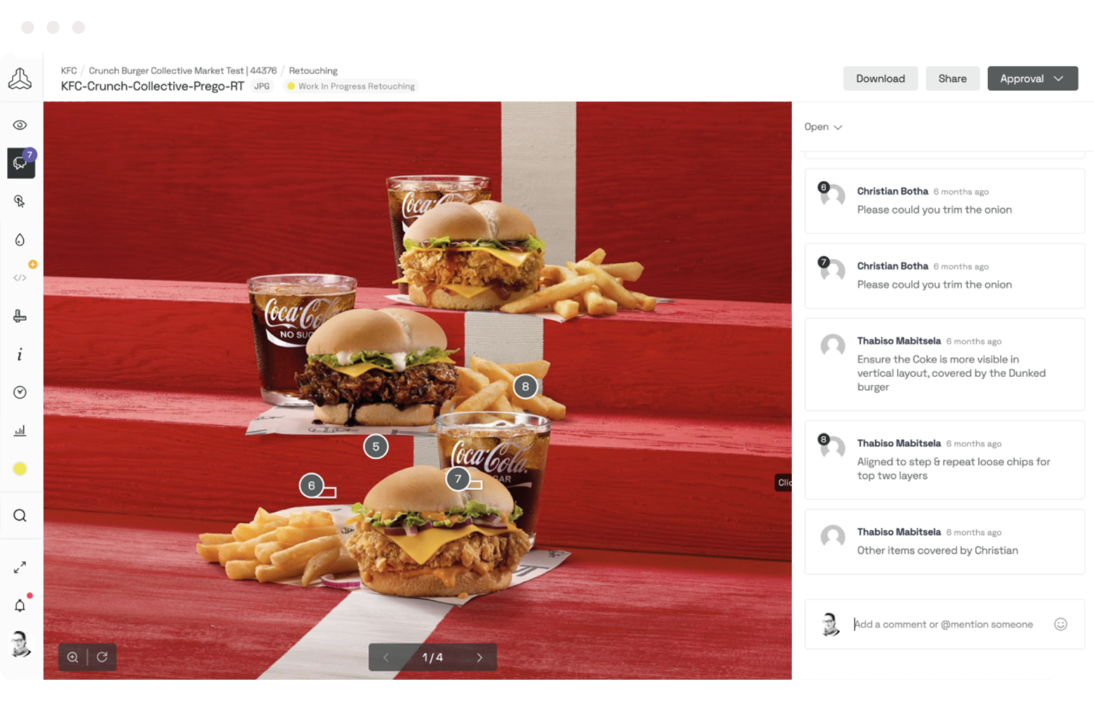
- Multi-brand structure: If you’re already sitting on a set of different brands, or you might be expanding in the future, a digital brand guidelines solution has the potential to house all your brands in one place, so you don’t need to create 50 PDFs all named “brand_X-V2_2023.”
Digital brand guidelines offer enhanced accessibility, interactivity, ease of updates, searchability, integrations, and collaboration compared to outdated PDF brand guidelines. Also, they’re cooler. Why? Well, for starters, they empower entire corporations to maintain brand consistency, engage users, and facilitate seamless global collaboration across internal and external teams (wherever in the world they might be).
Digital brand guideline examples
The strongest brands go beyond visuals and voice in their documentation thereof, delving into the brand's mission, values, and vision. Additionally, they often include interactive features, making them easily accessible and engaging for stakeholders. These exemplary brand stories can act as an inspiration and benchmark for all brands out there that want to become more cohesive, and memorable.
Some of the best examples of brand platforms have found the perfect balance of comprehensive and effective brand management. They’ve set the standard for clarity and consistency in brand representation, including well-defined visual elements such as logos, color palettes, and typography, accompanied by clear usage instructions. They incorporate detailed brand voice guidelines, ensuring a unified and recognizable tone across all communications. Here are some examples:
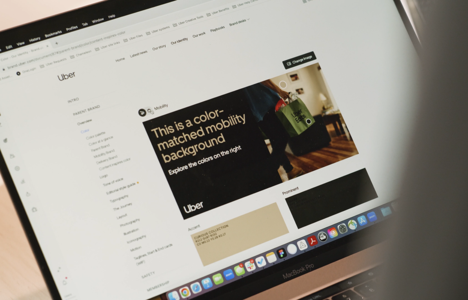
Uber: Driving the future of branding
Uber has revolutionized transportation, facilitating 23 million daily trips across 72 countries and 10,500 cities. The brand's success lies not just in being a popular choice for transportation, but in effectively conveying its vision through relevant messaging.
At Uber, a centralized brand platform system allowing easy access to digital brand guidelines, assets, and collaboration tools, facilitates seamless communication and efficient brand management. As a result, they’ve improved brand consistency, a streamlined design workflow, and an enhanced brand experience for its users worldwide. A true brand management benchmark.

KIA: A brand that inspires
Kia, a leading global car brand, is guiding consumers in the movement and mobility industry. In recent years, it has transformed from a car manufacturer to a brand that inspires and offers innovative technology, services, and mobility solutions.
By leveraging Frontify's extensive range of tools, Kia's design team successfully maintained consistent brand guidelines and assets across all touchpoints. The platform's centralized system enabled easy access to essential brand resources, fostering effective collaboration and communication among team members. As a result, Kia achieved improved brand consistency, streamlined design workflows, and strengthened brand identity, contributing to a more unified and engaging brand experience for its customers.
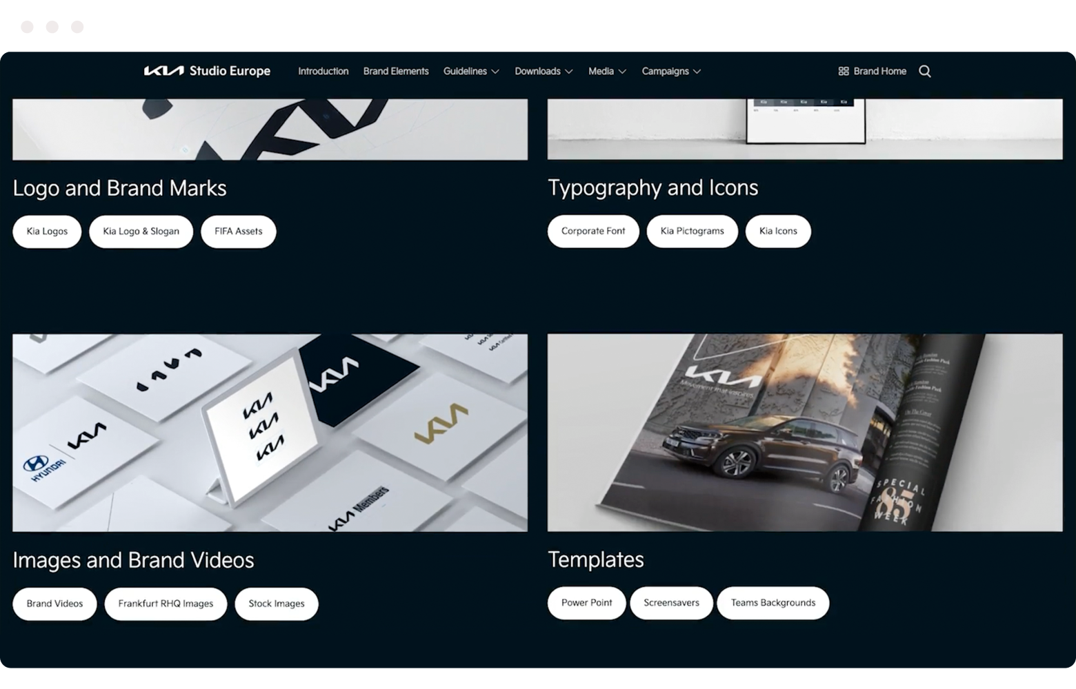
Learn more about KIA’s brand platform →
Vacasa: Home sweet brand home
Vacasa revolutionized the vacation rental experience, managing over 37,000 properties across North and Central America. Based in Portland, Oregon, this international company has witnessed remarkable growth since its inception in 2009.
Utilizing Frontify's comprehensive toolkit, Vacasa's design team ensured consistent digital brand guidelines and assets across various channels and touchpoints. The platform's centralized system facilitated easy access to critical brand resources, enhancing collaboration and communication among team members. As a result, Vacasa achieved improved brand consistency, streamlined design workflows, and a strengthened brand identity, contributing to a more cohesive and impactful brand experience for its audience.

Check out the full story about Vacasa’s digital brand home →
BVB: The 30m people brand
With nearly 30 million fans worldwide, BVB is a brand that ignites passion. It’s true that sports brands require a unique approach to meet fan expectations. To ensure their brand delivers, BVB's internal and external brand builders collaborate, maintain consistency, and work efficiently across their brand platform.
By leveraging Frontify's versatile tools, and the digital brand guidelines especially, BVB's design team ensured a consistent brand across various platforms and communication channels. The platform's centralized system allowed easy access to essential brand resources, fostering seamless collaboration and communication among team members.
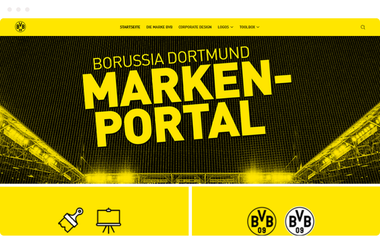
Learn more about the BVB brand home here →
Create digital brand guidelines with Frontify
Thousands of the world’s leading brands use Frontify’s digital brand guidelines as well as their extended platform to stay ahead of competition, build customer loyalty, and create brand magic.
- Be your best brand self: Customize guidelines with over 40 different content elements to cover all the different aspects of your brand, or build your own bespoke guideline blocks with our SDK.
- Build a community around the brand: Share guidelines with your internal team and external agencies and partners, including setting access restrictions where necessary; keeping everyone aligned and on brand at all times.
- Update them yourself: Whether you want to entirely rebuild the guidelines or just add a little update, you can do that by yourself. Our user-friendly platform allows you to take that pricey creative agency off speed dial.
- Create an expandable brand ecosystem: Connect your guidelines with other areas of the Frontify platform. With Digital & Print Templates, your team can create their own branded assets, and with our Digital Asset Management (DAM), you can store and organize all your brand materials. You can also integrate your creative and/or marketing tools directly to Frontify. Anything’s possible.
So, are you ready to start building your digital brand guidelines? Request a demo to learn more about the Frontify platform, or begin your free trial to start strengthening your brand today.
