A company’s logo is a representative symbol that helps customers identify its brand and products. It’s a symbol of a brand’s personality and where it came from, just like a traditional coat of arms. And a good logo attracts customers by showcasing the “detail and quality” they can expect from a brand’s products, according to Logan Young, creator of All the Differences.
But what separates a truly great logo from the rest?
A good logo is more than just an aesthetically appealing trademark — although that’s important, too. To be truly great, a brand’s symbol “needs to be both functional and beautiful,” says digital marketing expert Serbay Arda Ayzit.
Here are the brands that other designers believe got it just right.
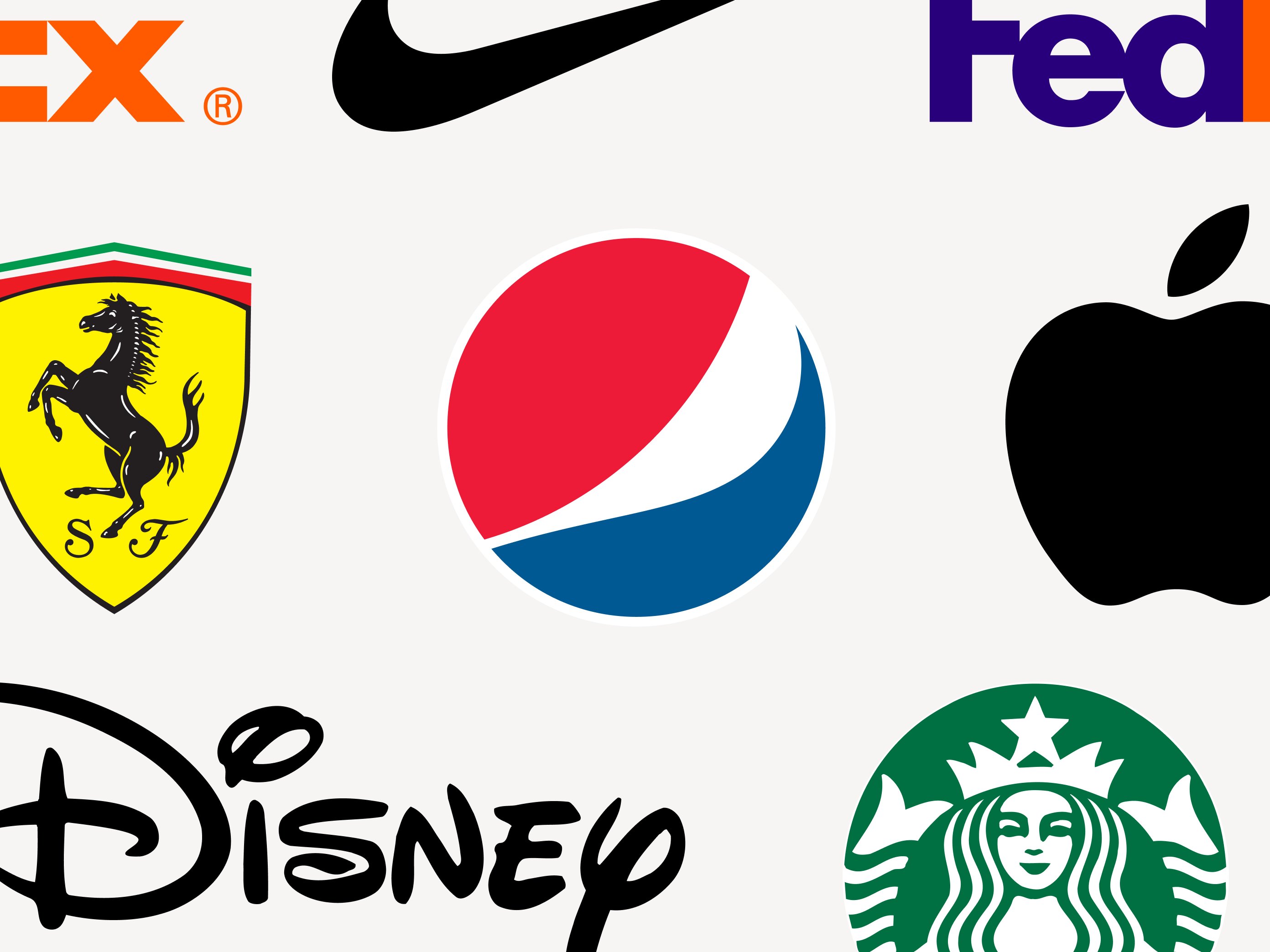
Nike

In 1971, Nike paid designer Carolyn Davidson $35 to create its logo. By 1998, Nike’s logo was so famous that 97% of Americans recognized it as a symbol of athleticism. And more than 50 years after its introduction, the Swoosh remains one of the most famous logos in the world.
The Swoosh nails it when it comes to design, says Ayzit. It’s a perfect example of a logo that’s simply designed and easy to recognize. But what really sets the Swoosh apart from others, Ayzit says, is its use of symbolism to effectively communicate the “core message and values of the brand.”
According to Robert Hoffman, marketing manager at Cashback Hero, the logo “perfectly encapsulates the spirit of Nike’s philosophy.” The check mark shape of the Swoosh represents the wing of the Greek goddess of victory: Nike.
Mythology often depicted the winged goddess presenting trophies and other awards to winning athletes and heroes. This makes Nike’s logo a fitting reminder of the athletic brand’s mission to “help athletes reach their potential.” And as a brand symbol on the side of a shoe, the dynamic Swoosh communicates forward motion, advancing with strength.
Apple

An apple with a single bite taken out of it is unmistakably a symbol of modern technology. And considering the name of the company is Apple, it’s also the purest symbol possible. And just like Nike’s Swoosh, its consistent use over the years has cemented Apple’s logo as another of the most iconic and easily recognizable logos in the world.
While, technically, it hasn’t always been the simple, titanium-finish design it is today, one thing has remained consistent throughout the logo’s evolution: the image of an apple.
Apple’s original logo was designed by one of the organization's co-founders, Ron Wayne. It was an intricate and hard-to-read design that featured Sir Isaac Newton beneath an apple tree. But Steve Jobs scrapped the original design when Wayne left the company after less than a year. Apple replaced it with the first iteration of its modern logo in 1977. The redesign stripped away everything from the original design except for the apple.
A simple and balanced design makes the logo easy to identify. The bite out of the apple helps clarify the image — even when the logo is tiny, it’s easily recognizable as an apple, not a cherry or orange. And an array of bright colors in the 1977 design represented a feature that distinguished Apple’s computers from its competitors: color capability.
But why did Apple trade the rainbow for the current monochrome version of its logo?
As Young notes, a logo’s success ultimately depends on how well it represents the brand’s values. And limiting the logo’s color usage means it better reflects Apple’s core design philosophy: simplicity.
FedEx

The FedEx logo fully demonstrates the use of negative space. See the arrow between the uppercase “E” and lowercase “X”? The lettering is more than a wordmark; it is a creative combination of two typefaces, Univers and Futura bold. And the logo’s design has won several awards.
How did FedEx come up with its clever monogram? By hiring an award-winning team of experienced and creative designers.
As Sinoun Chea, CEO and founder of ShiftWeb, points out, experienced designers best understand “how to craft compelling brand logos.” They also know how to use symbolism to create images that have positive associations in the minds of customers.
In FedEx’s case, the hidden arrow was also the result of a little luck. The team FedEx hired created more than 200 logos during the design process. And it was only when looking at these various designs that someone came up with the idea of introducing an arrow into the typeface. The arrow subtly suggests “getting from point A to point B reliably, with speed and precision.” Once the designers finalized the idea, it was just a matter of finding the right font and perfecting the spacing, so the company name looked natural within the logo’s design.
Pepsi

Pepsi paid creative agency Arnell Group $1 million to update its logo in 2008. Less than a year later, Pepsi and its partner gained widespread media attention when the creative agency’s in-progress design document was leaked online. Even though it brought a wave of negative press and speculation that Pepsi’s new logo was part of an internet hoax, the beverage company still uses the logo today. And it’s widely recognized as one of the best logos of all time.
Arnell Group’s design strategy PDF is filled with vast amounts of white space and buzzwords — none of which relate to soda or Pepsi’s brand mission. In fact, Fast Company described the 27-page document as “branding lunacy to the max.”
In the document, the creative agency explains the design’s connection to famous works of art like the Mona Lisa and even the Earth’s magnetic field. These over-the-top claims were probably just a flashy way to win Pepsi’s business. But that doesn’t mean Arnell Group designed an unsuccessful logo.
“The Pepsi Globe is one of the most recognizable brand graphics of all time,” says Andrew Cussens, owner of FilmFolk. Here’s what he thinks makes the logo great:
- The white stripe in the center symbolizes the smile of joy that Pepsi’s products bring to customers.
- The globe shape of the logo “communicates warmth and community.” It also emphasizes a commitment to bringing “different people and cultures together.”
- The red, white, and blue color scheme gives the logo a “clean-cut and visually appealing look.”
Ferrari

Did you know Justin Bieber isn’t allowed to buy a Ferrari because of his reckless driving history? That’s how serious the auto brand is about preserving its brand image and reputation. And its emblem is no exception. The brand’s iconic logo holds deep symbolic meaning that dates back to its earliest days in racing.
The most prominent and important symbol in the logo is the Prancing Horse. Those who aren’t familiar with luxury vehicles could easily confuse Ferrari with its competitor Porsche, which also uses the black stallion in its logo. But Ferrari has never worried about this, maintaining that it is the only brand that truly “earned” the prestigious emblem of the Prancing Horse.
While the symbol dates back to 1692, it became a symbol of Italian pride during World War I when a noteworthy pilot painted it on the side of his planes. And it was the mother of that WWI pilot who suggested that Ferrari’s founder paint the symbol on his race car as a sign of luck. Ferrari has proudly used the trademark as a central logo feature ever since.
The yellow shield that surrounds the horse represents the city of Modena, the hometown of Ferrari’s founder. The bright color also helps it stand out from other auto manufacturers with less colorful logos, like Mercedes-Benz and Audi. To represent the company’s Italian roots, there are green, white, and red stripes forming the top of the shield. And the initials “SF” at the bottom of the shield pay homage to the brand’s racing division: Scuderia Ferrari.
Airbnb

Great logos, according to Chea, create a positive brand perception in the minds of customers, which is exactly what Airbnb’s minimalist logo is designed to do. Airbnb named its logo the Bélo. And it symbolizes the idea that “a traveler can feel at home anywhere.”
The graphic design combines four symbols:
- The head of a person represents Airbnb’s collective of members who connect and share experiences with one another.
- A location pin signifies the widespread network of hosts that allows travelers to feel a sense of “belonging” anywhere in the world.
- A heart showcases the brand’s goal of building community and creating a sense of “belonging.”
- The letter “A” indicates the brand name.
Today, Airbnb’s logo is easily recognizable. But when the company rolled out the design as part of a rebrand in 2014, it faced backlash for its similarity to the logo of a much smaller brand, Automation Anywhere (which ultimately redesigned its logo). The Bélo was circulated online by users who laughed at its design. But none of this bothered Airbnb.
The company even launched a feature that allowed users to design their own versions of the logo. All of this attention and visibility, even though it was negative, is probably why so many people recognize the Bélo today. So, if you’re confident in your logo’s design, follow Airbnb’s lead and don’t let a bad press moment deter you from sticking with it.
Starbucks

Starbucks’ logo has always stood out as unique from any other coffee company. Its first logo was designed in 1971 and featured many of the same basic features as the modern trademark, including the iconic mermaid that has become the logo’s central figure. It also incorporated the original name of the company and a brown background, which represented the color of coffee.
Over the years, the coffee company has simplified its design. Starbucks’ current logo, graphic designer Chris Bryant says, is modern and “uncluttered.” The original design featured an intricate illustration of a mermaid, which was a fitting symbol for a brand that took its name from Moby Dick. But each logo redesign has made the siren illustration more clear and easy to read. And by trading the original brown color for a brighter green, Starbucks also made its design more eye-catching.
This simplicity and the consistent use of the siren imagery throughout its brand history have made the logo instantly identifiable and easy to remember. In fact, Starbucks' Siren is so iconic that the company name hasn’t been part of the logo for more than a decade.
The logo is also incredibly versatile. As Bryant notes, Starbucks can easily use it in a “variety of contexts,” including in-store signage and merchandise like cups. The Siren logo is even the profile photo for the brand’s social media profile and the icon for the Starbucks mobile app. And according to Eleanor Patchen, marketing and content lead at MugsCafe.org, this versatility helps Starbucks “stay at the forefront of branding in an ever-changing digital landscape.”
World Wildlife Fund

The World Wildlife Fund (WWF) logo is instantly recognizable because of its minimalistic design and clear use of contrast. The panda imagery also achieves the goal set by WWF of overcoming language barriers and communicating the organization’s dedication to protecting “places and species that were threatened by human development.”
The logo’s design was inspired by Chi-Chi, a world-famous panda who lived in captivity at the London Zoo. Great Pandas were one of the world’s most endangered species when Chi-Chi arrived in London in 1958. The beloved animal quickly became the zoo’s number-one attraction and a celebrity. And as the symbol mascot for WWF, Chi-Chi’s iconic image came with a few major logo design benefits.
Pandas are “such endearing animals,” says Arthur Worsley, founder of The Art of Living, that even individuals who have never heard Chi-Chi understand the animal’s symbolic significance. And within a logo’s design, Worsley says the panda’s image evokes “strong emotional responses from the global audience.”
The contrast of the animal’s black and white fur creates a striking image. And using the panda’s natural coloring in its logo also allows WWF to “save money on printing costs.”
Patagonia

When consumers think about positive brand perceptions, Patagonia is one of the first companies that comes to mind. And according to Statista, that’s because it has a better reputation than any brand in the US. This is particularly impressive when you consider the fact that Patagonia doesn’t do “a lot of traditional advertising.”
Instead, the brand sets itself apart by living its mission to end fast fashion. Patagonia’s clothing is built to last generations. It designs simple clothing that doesn’t cater to changing fashion trends — the basics use colors that never go out of style and typically feature only the brand’s logo. And that makes Patagonia’s logo a powerful symbol. Today, it’s synonymous with environmental advocacy.
But what makes Patagonia’s logo so iconic that multiple generations have wanted to wear it on their jackets, fleeces, and shirts?
- The design is easy to read because color is used to create contrast.
- The mountain design represents the mountain range that inspired the company’s name.
- Mountains are also an easily identifiable, natural land formation, which evokes the outdoor environment Patagonia’s clothing is designed for.
- The typography is clear and readable, which makes the brand name easy to identify.
Disney

Today, Disney uses its founder’s signature as its logo. And Disney uses its logo everywhere. The founder’s signature appears at the start of films and on physical products like toys and clothing. It even appears on TV home screens as a streaming option. And it’s this widespread usage that has been “consistent for decades” that Lisa Richards, CEO and creator of the Candida Diet, says makes the logo easy to identify.
The name “Disney'' is synonymous with both the company and the man who started it — and it has always been a part of the logo. Along with founding the production company, Walt Disney was an integral part of everything else his brand produced. He even lived at Disneyland during the theme park’s construction — and his one-bedroom apartment remains a part of the park, just the way Disney left it.
While Disney’s name has always been central in the logo, its design has gone through many evolutions throughout the company’s history. And many characteristics have changed with each redesign.
The original company logos and letterheads used simple typography. And soon after the company was founded, one logo redesign introduced Mickey Mouse, who would be a part of the logo for many years. And eventually, the lettering changed from simple, clean typography to the less-clear, personal handwriting of the company’s founder.
Using the founder’s handwriting meant that there wasn’t a guarantee that early audiences would be able to read the name of the company. But for Disney, the change worked. And for people like Richards, the introduction of the founder’s handwritten signature only makes the image “more compelling.”
Shell

Shell’s logo has been easy to identify as a seashell for more than 100 years, which makes it the oldest and most consistently used trademark on our list. It also changed the game of logo design when it became the first brand to employ “artists” rather than traditional designers.
The first Shell logo was trademarked in 1900 and featured a simple black and white image. Four years later, the company changed its logo design from a mussel shell to a scallop shell — and the basic design has remained virtually unchanged since 1904.
The only major change to the company’s logo was the introduction of red and yellow, which have been a part of Shell’s branding since the beginning of the 20th century. And since no other company in the industry uses similar colors, according to Michael McCarty, CEO of EDGE Fall Protection, this change helped Shell “stand out in a sea of competitors.”
A logo is only the beginning
If there’s one lesson to learn from all of the logos on our list, it’s that consistency is key. Consumers immediately recognize logos for brands like Nike and Ferrari because those companies have used the same trademark for decades. And even brands that redesign their logos, like Airbnb and Pepsi, have been able to overcome initial bouts of skepticism just by sticking with the new design. But to be consistent, you need to do more than just use the same trademark year after year.
Once you have a logo, it’s vital that everyone on your team understands how to use it. Developing brand guidelines gives everyone at the company the resources they need to maintain consistent branding, including the current logo in different, downloadable formats.
For instance, TikTok has a long list of “Do’s and Don'ts” that specify everything, from where to place the logo to how to adjust its sizing. Meanwhile, instead of restricting its logo usage, McDonald’s recently loosened its guidelines on how to use its trademarked images, including the Golden Arches.
The best brand guidelines go beyond logo usage to help teams use brand colors correctly, master the brand’s tone of voice, and understand what good branding looks like on different platforms. And once you’ve developed comprehensive guidelines, using brand-building software will help you centralize all of the resources and engage with your audience.